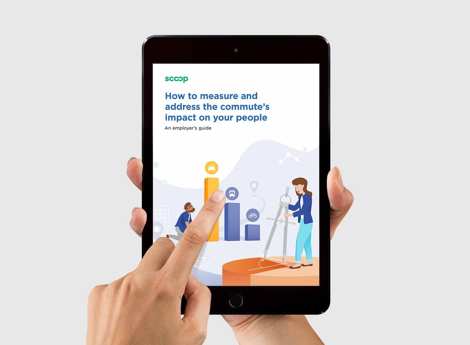
Overview
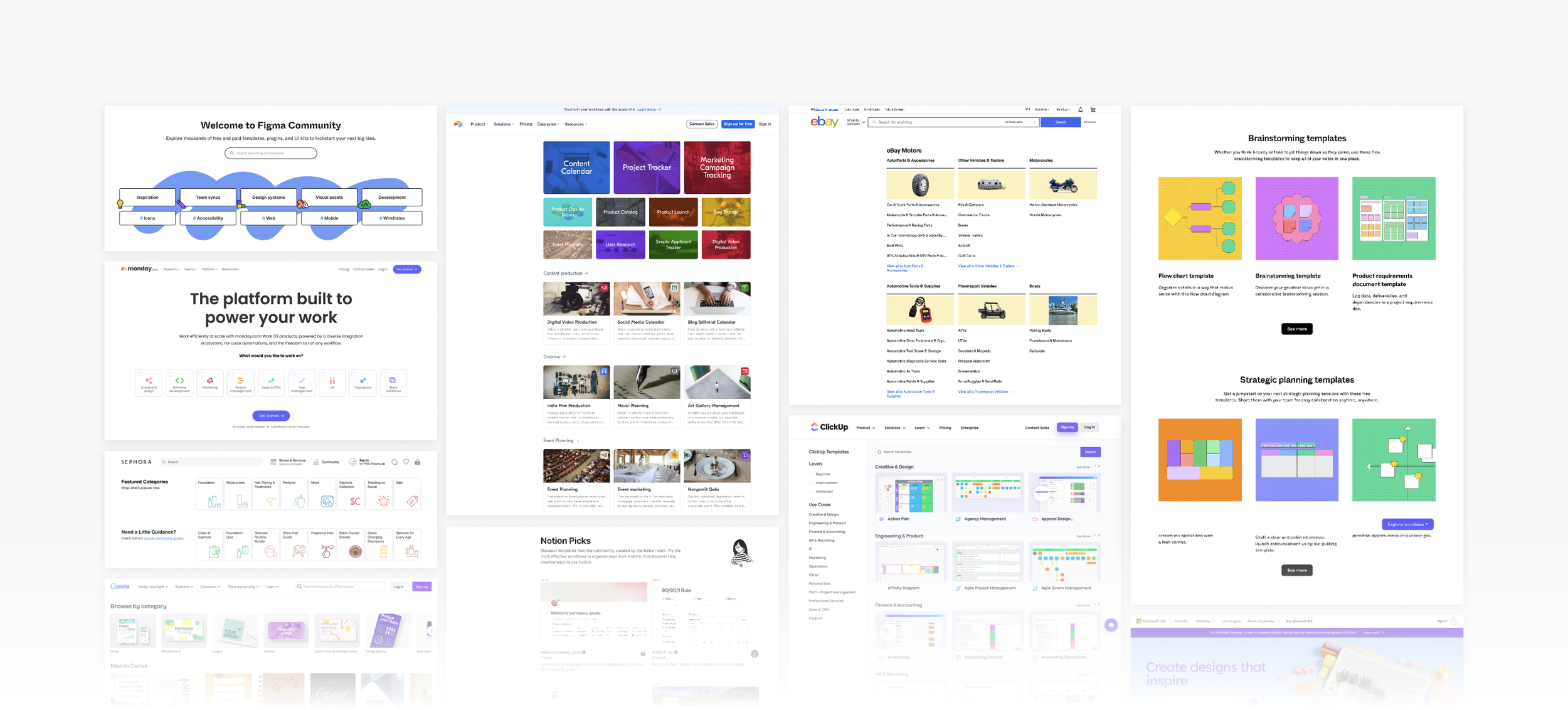
Jira Templates allow teams to start projects with ease and efficiency with pre-configured setups. The Jira template gallery page is a main entry for customers to trial the suite of Jira products.
Research revealed that customers found it difficult to choose the right Jira template on the gallery page, so the team's goal was to update the user experience to increase entrances and conversion.
The process
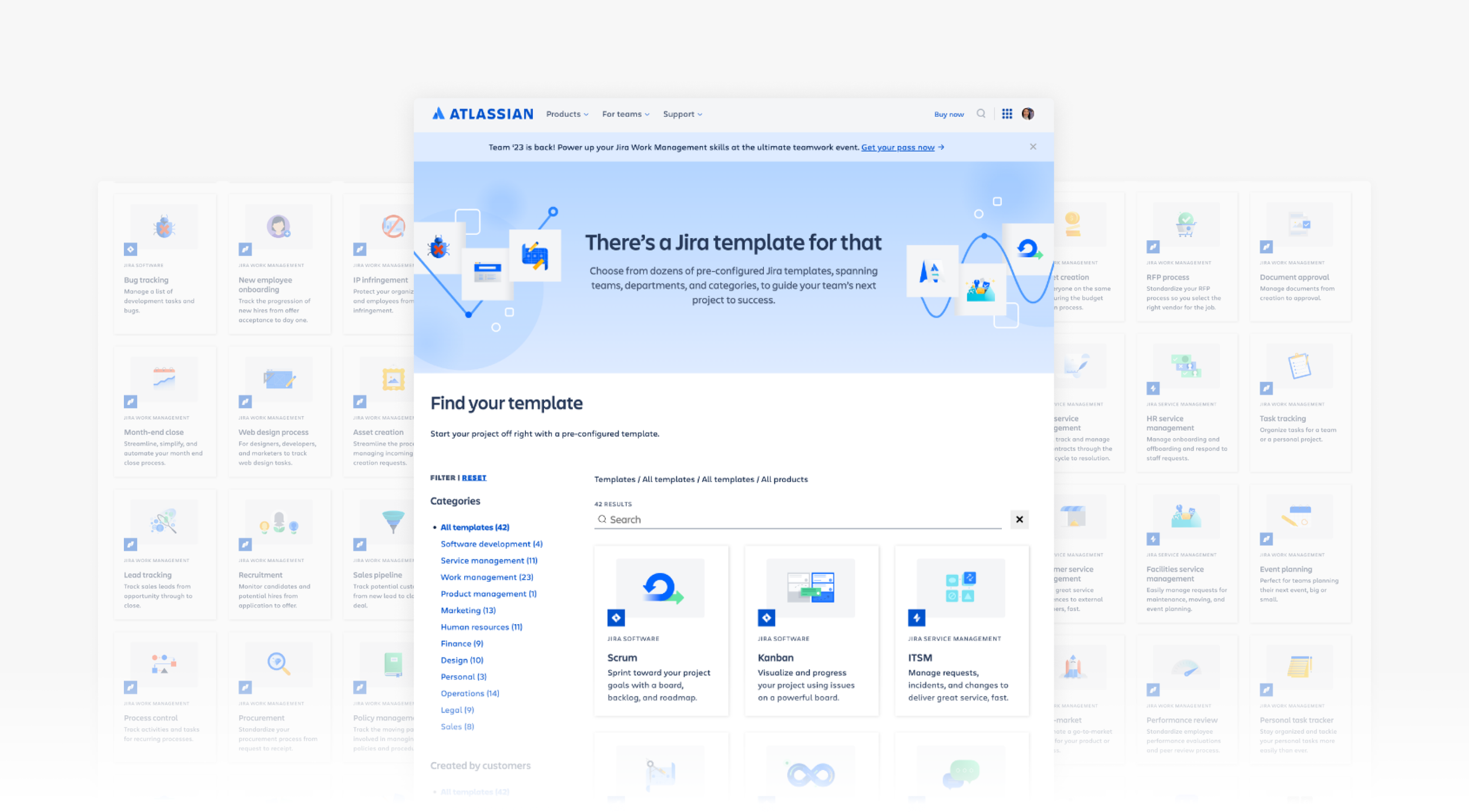
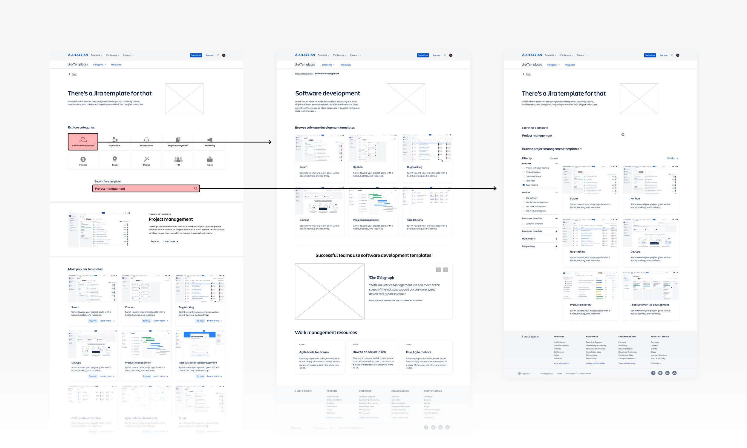
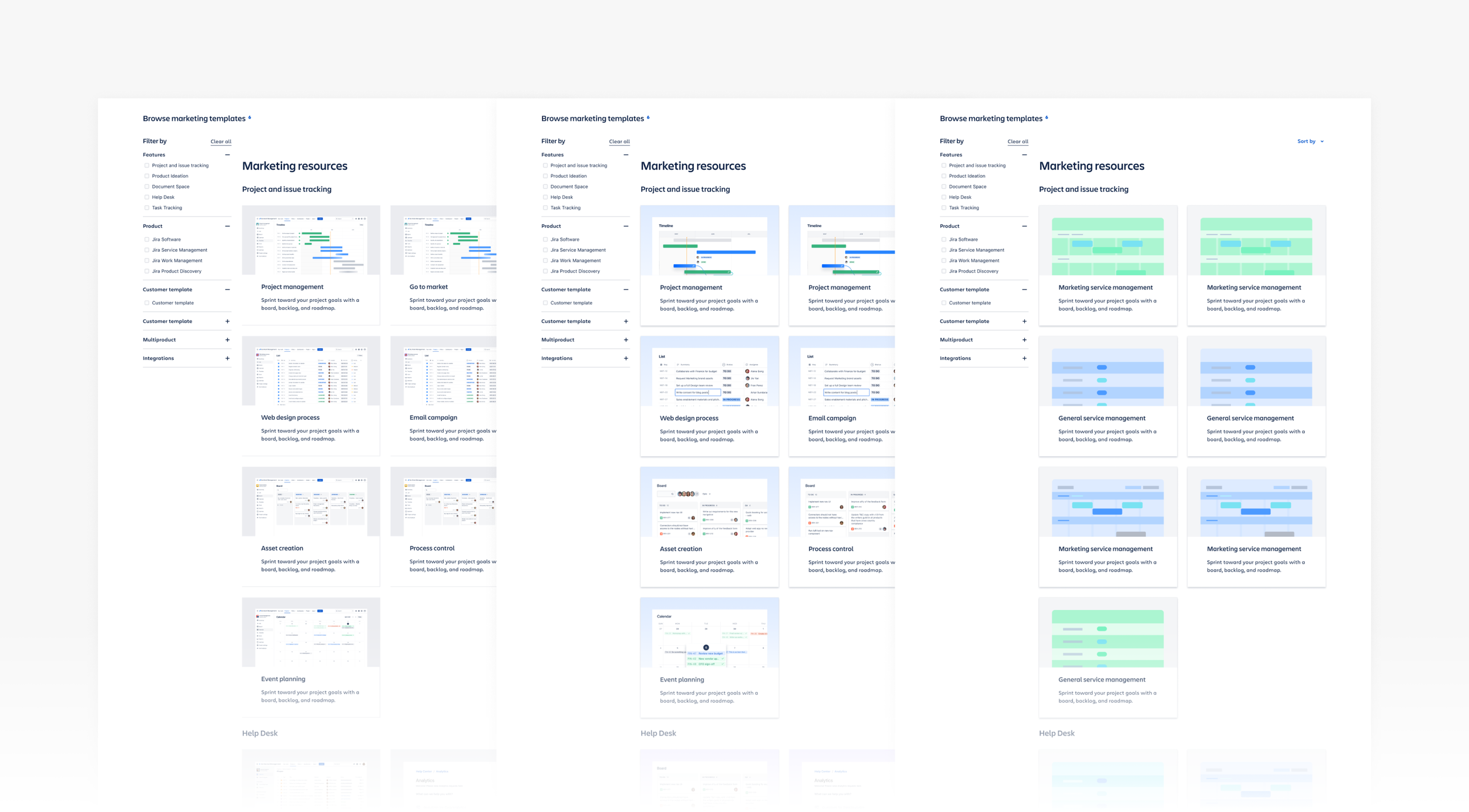
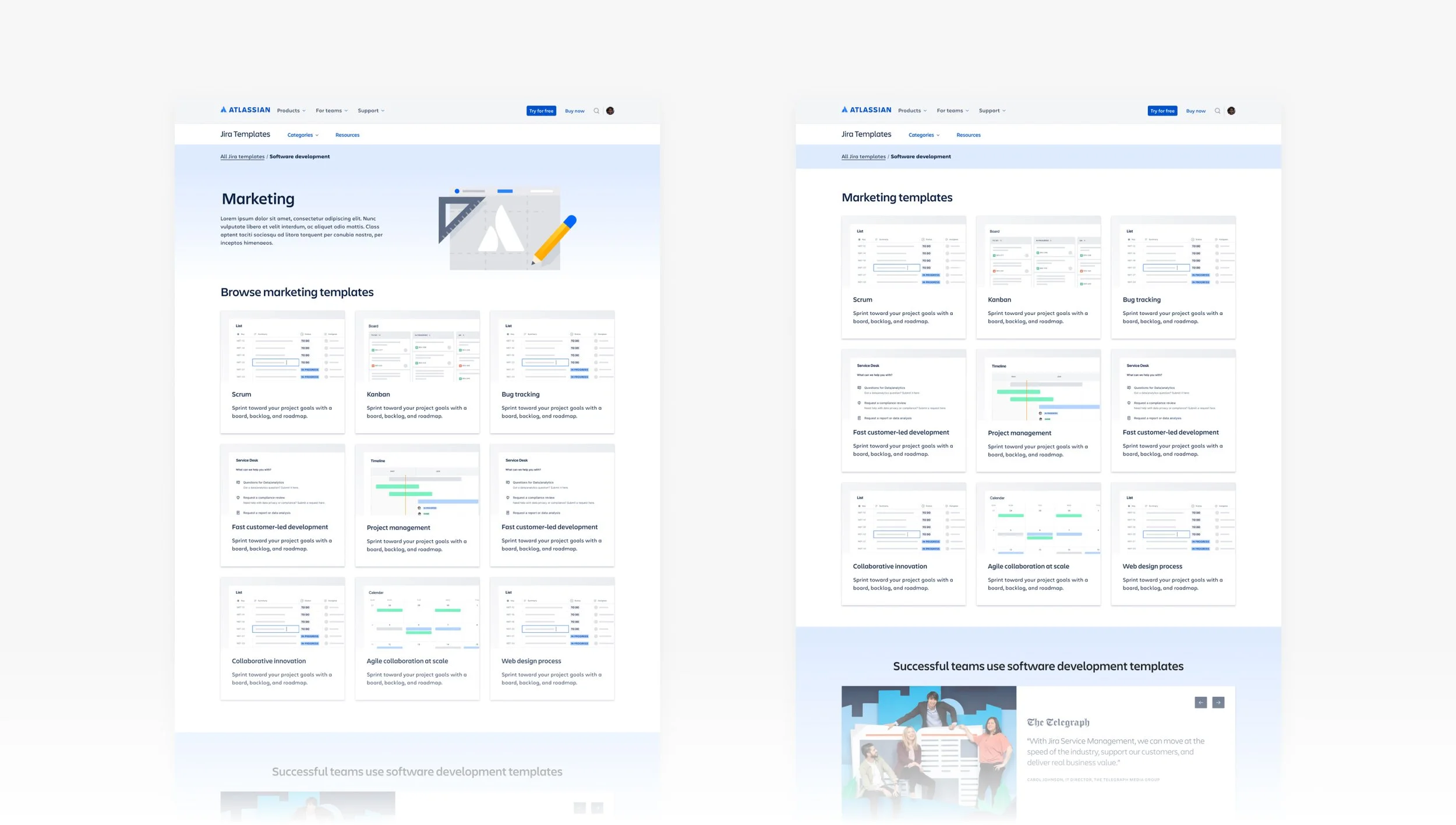
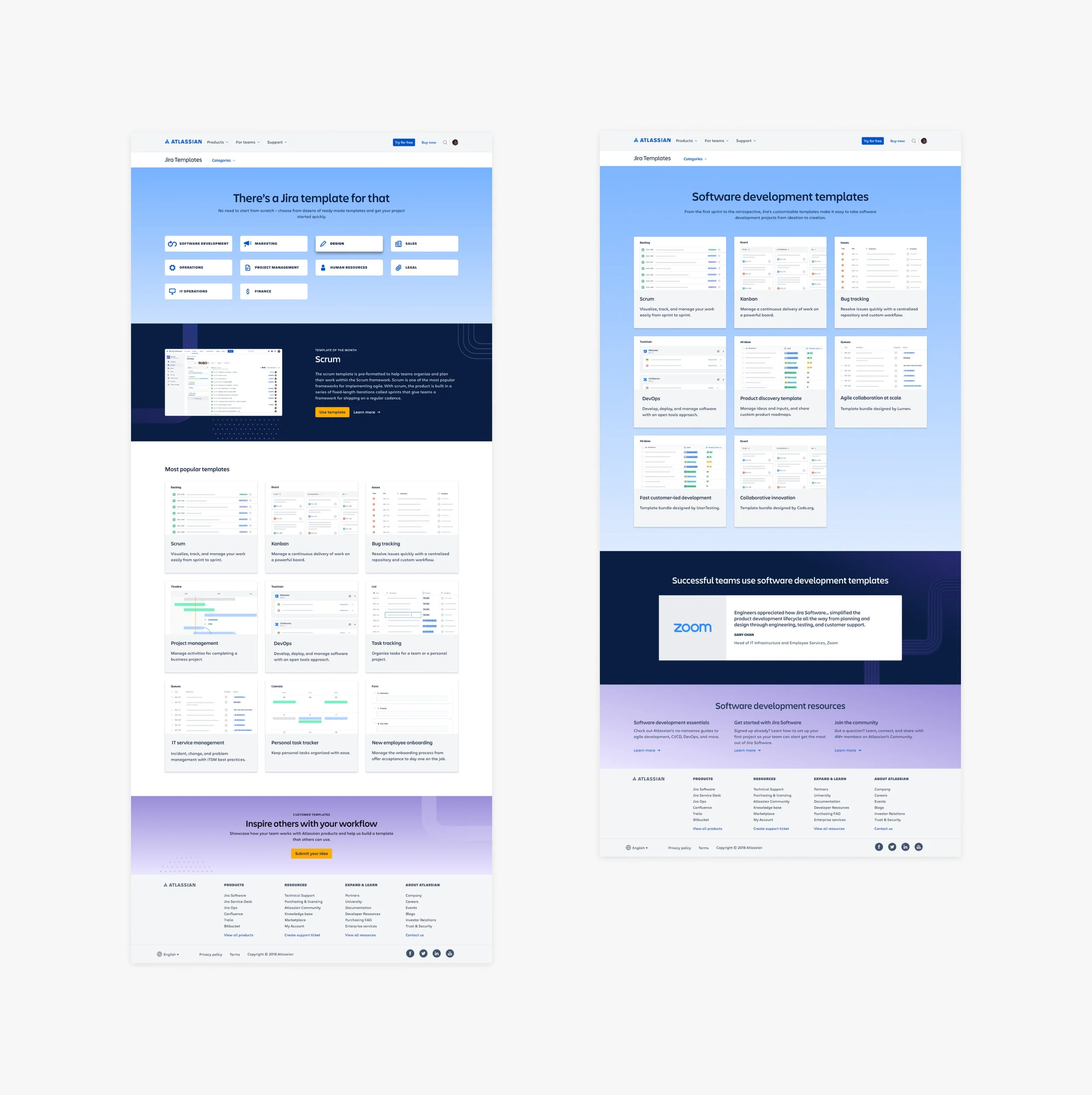
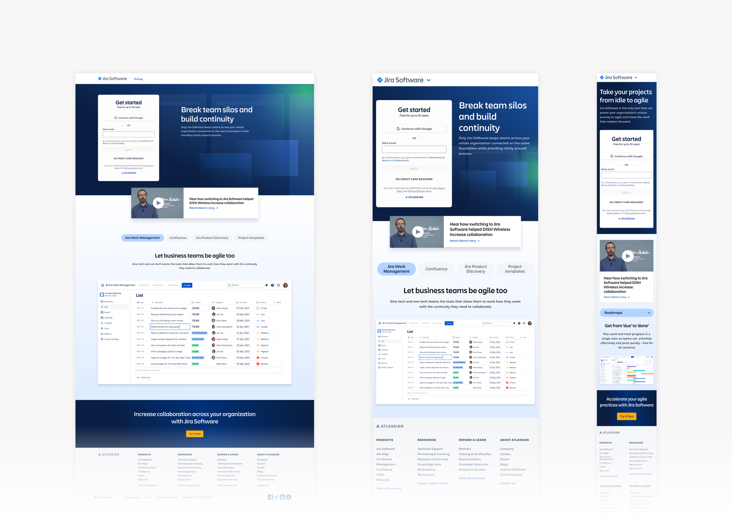
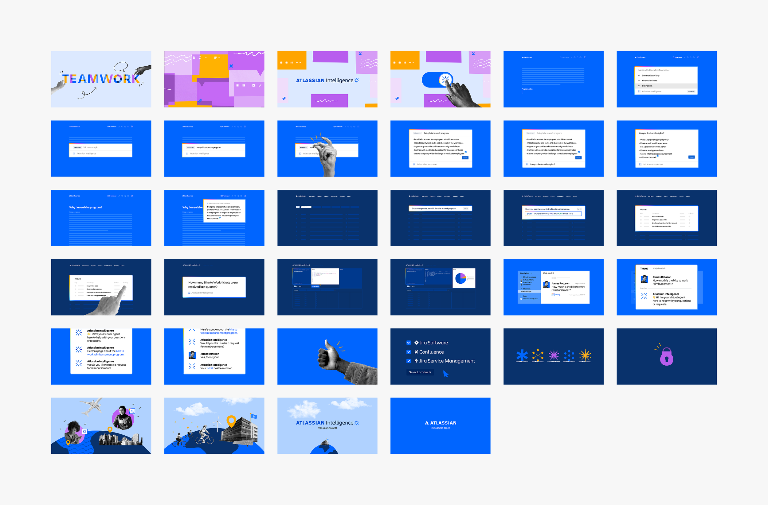
We updated the narrative to speak to team types and use cases, so this required us to redesign two existing pages and add one new page for teams. The new flow included the Jira template gallery homepage (1 page), the new team category page (11 versions), and the template details page (60+ versions).
With such a large project (over 70 pages), I focused on the Template homepage redesign and the new team page. I partnered closely with the UX designer and numerous PMMs on the content and design. The design process required research, creative iterations, and a thorough QA before shipping. The final design was cohesive, responsive, accessible, and aligned with our brand guidelines and design systems.
The impact
YOY results showed a 6.9% increase in entrances and a 36.7% increase of total signups about 2 months after the redesign.
This project also showed the impact of a design refresh approach versus a net new design.
The team
PMMs, UX designer, design manager, web producer
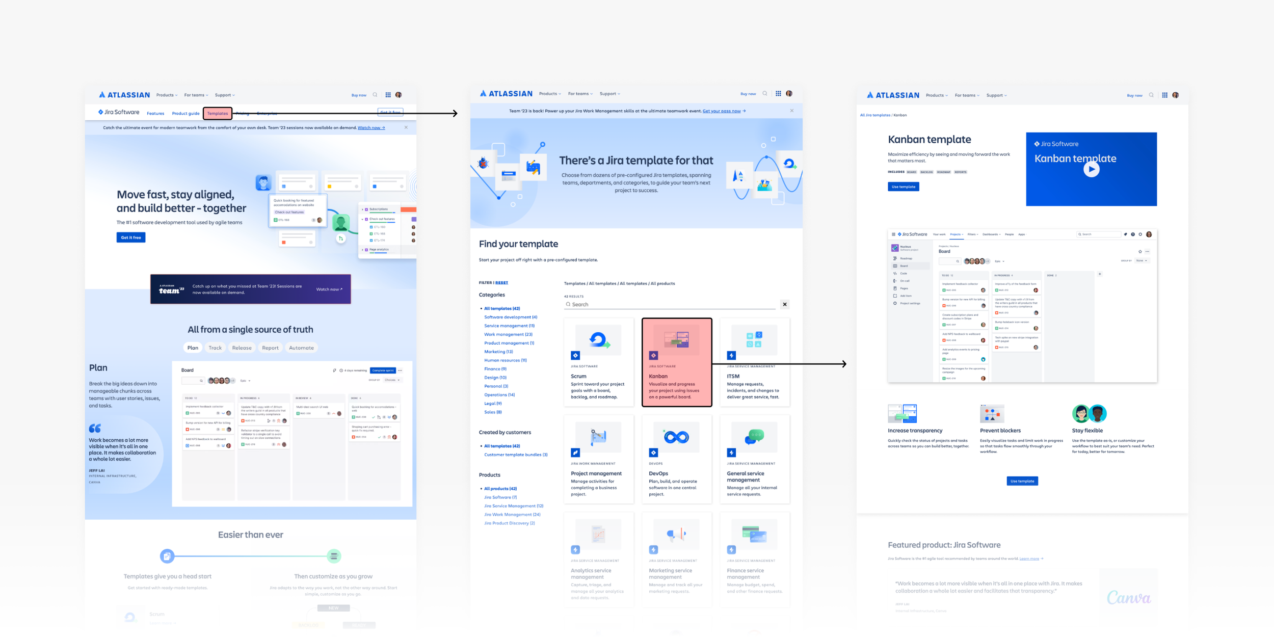
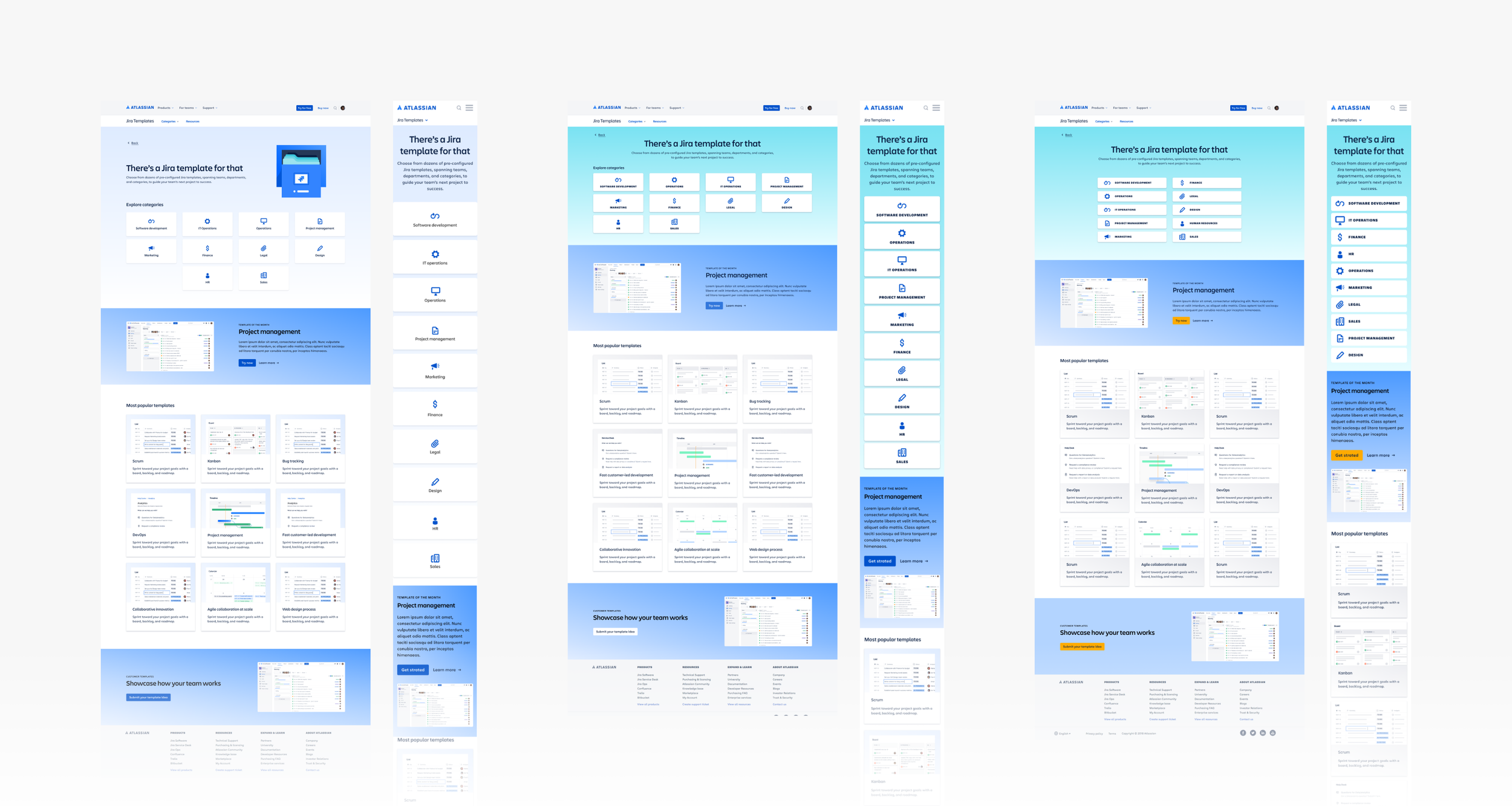
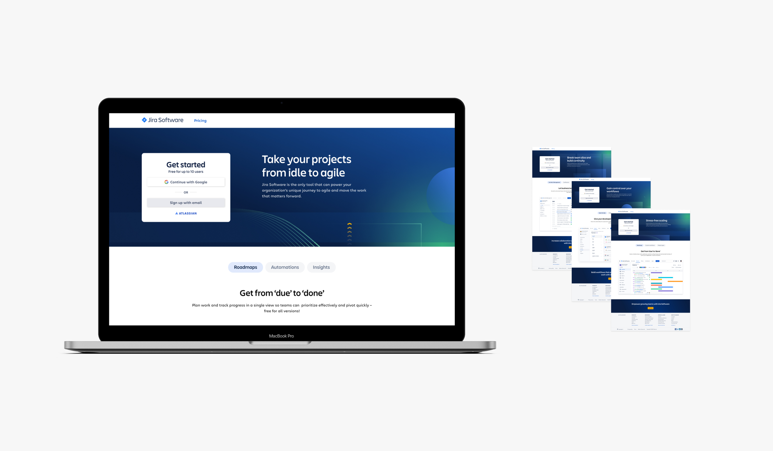
Original flow and design: Homepage > Template gallery > Template details
Original gallery page: 1 of the 2 pages I worked on
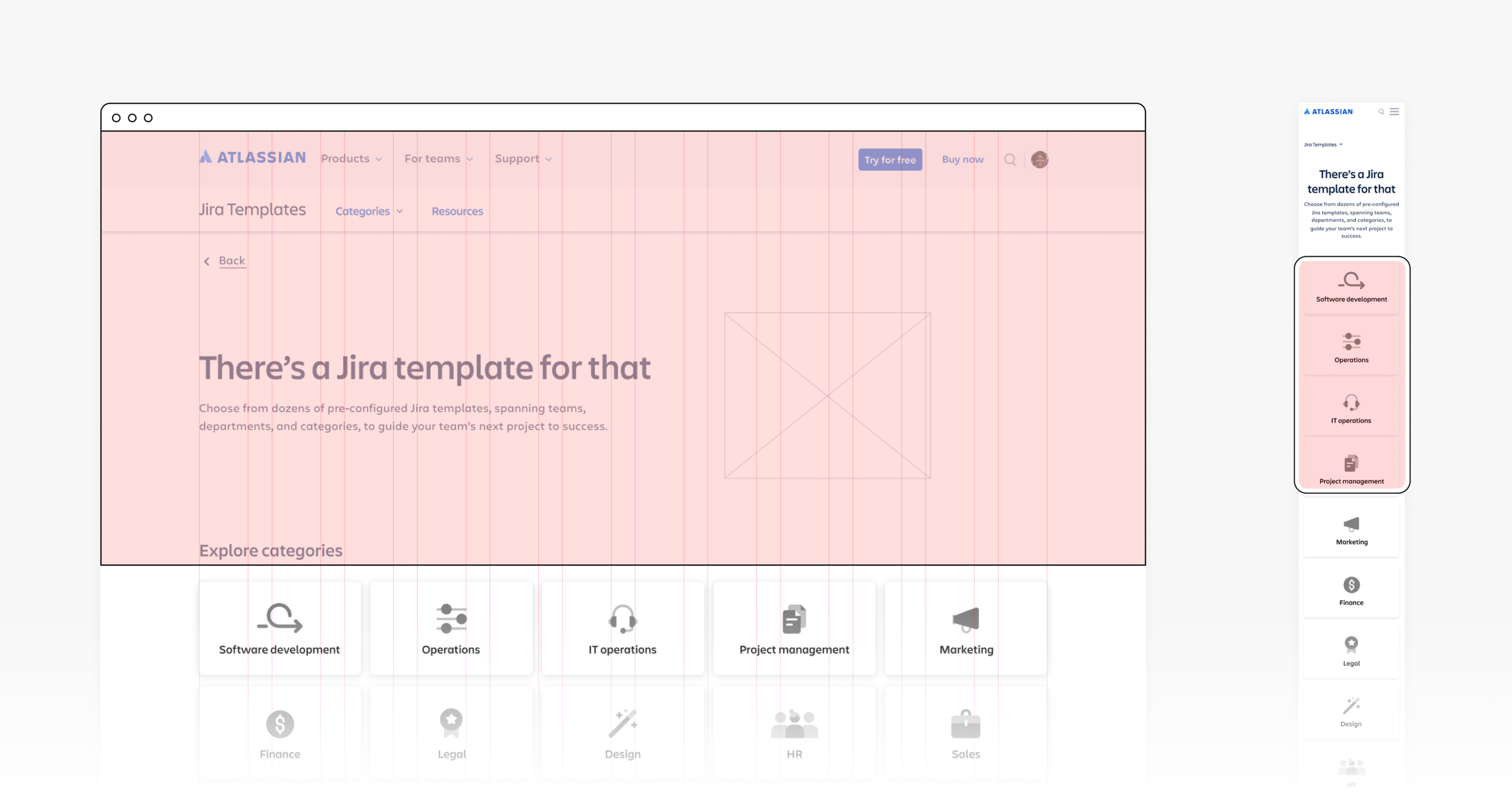
Wireframes: UX designer provided initial frames for team type narrative: Team page (replaced Gallery page) > Template details page
Wireframe assessment: frames did not align with our mobile and desktop grids or design system, and the interactive Team buttons fell below the fold.
Competitor audit: studied page layouts, product styling, card designs and color usage
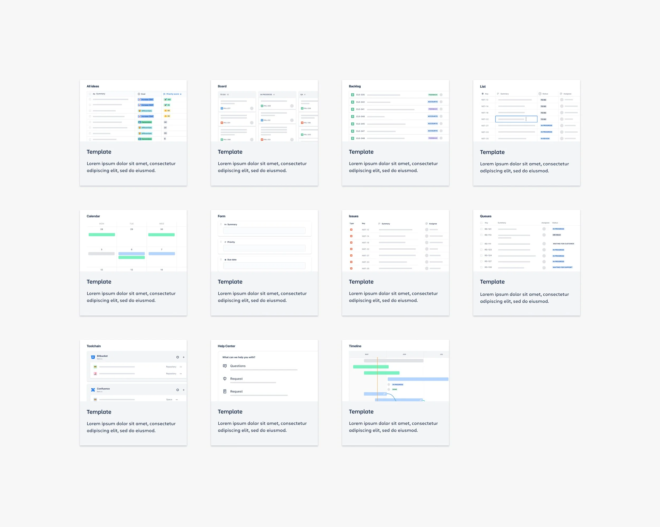
Gallery page exploration: ideated on the card design, product visual and color palette
Final card design exploration: variation in product fidelity, color and layout
Homepage design iterations: assessed the page length, content above the fold, optimization on desktop and mobile, color contrast and the need for visuals
Team page design iterations: assessed the same aspects on this page like page length and content above the fold
Final homepage: all Team buttons displayed above the fold on desktop and were maximized on mobile
Final team page: this page design was used for the 11 unique Teams
Final full-page designs: Homepage > Team category page
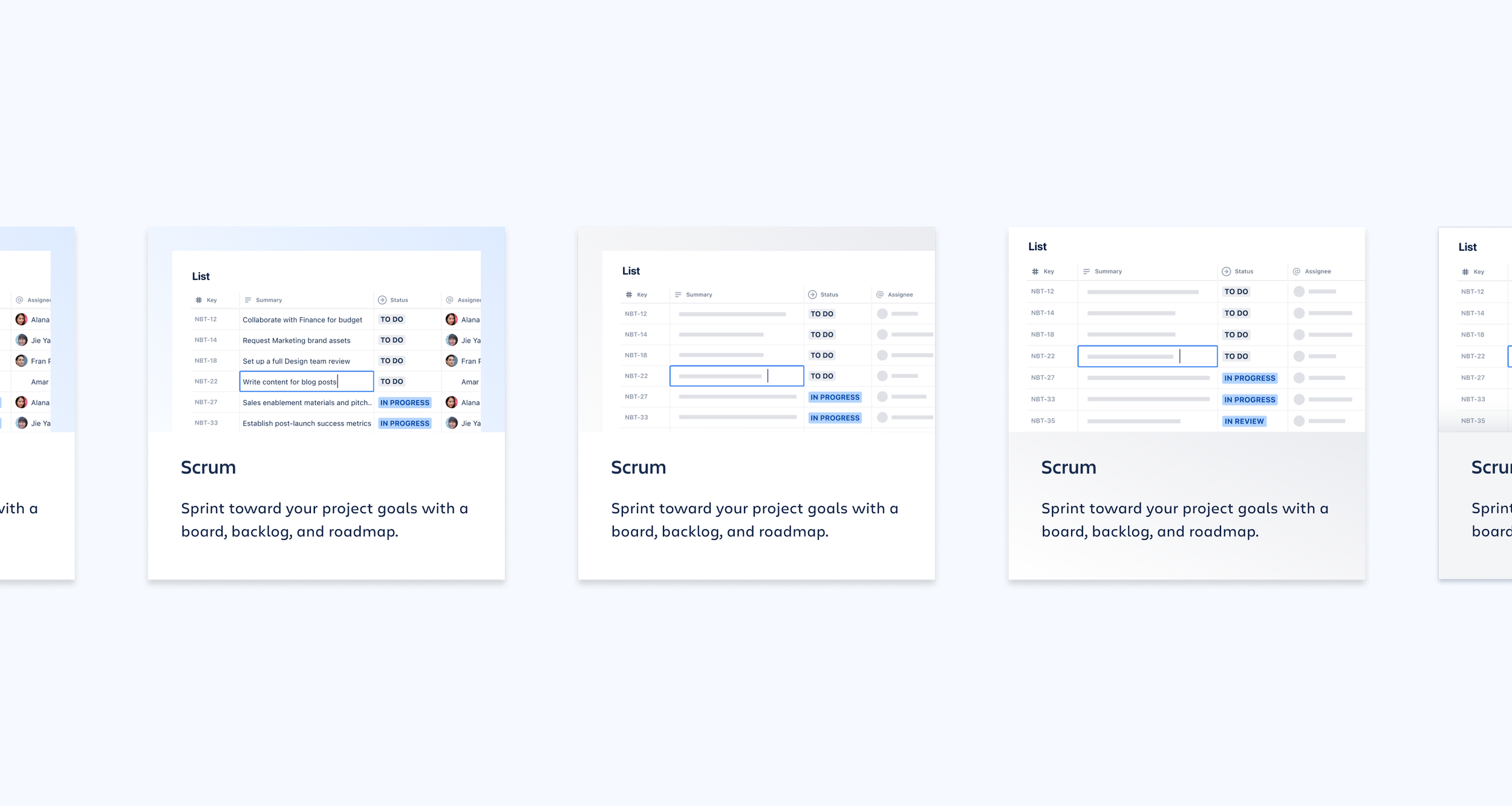
Final card design: 11 unique product screens were used across 60+ template cards
Final Figma handoff file: Homepage and Team page designs for desktop and mobile and spec’d for web producers
Overview
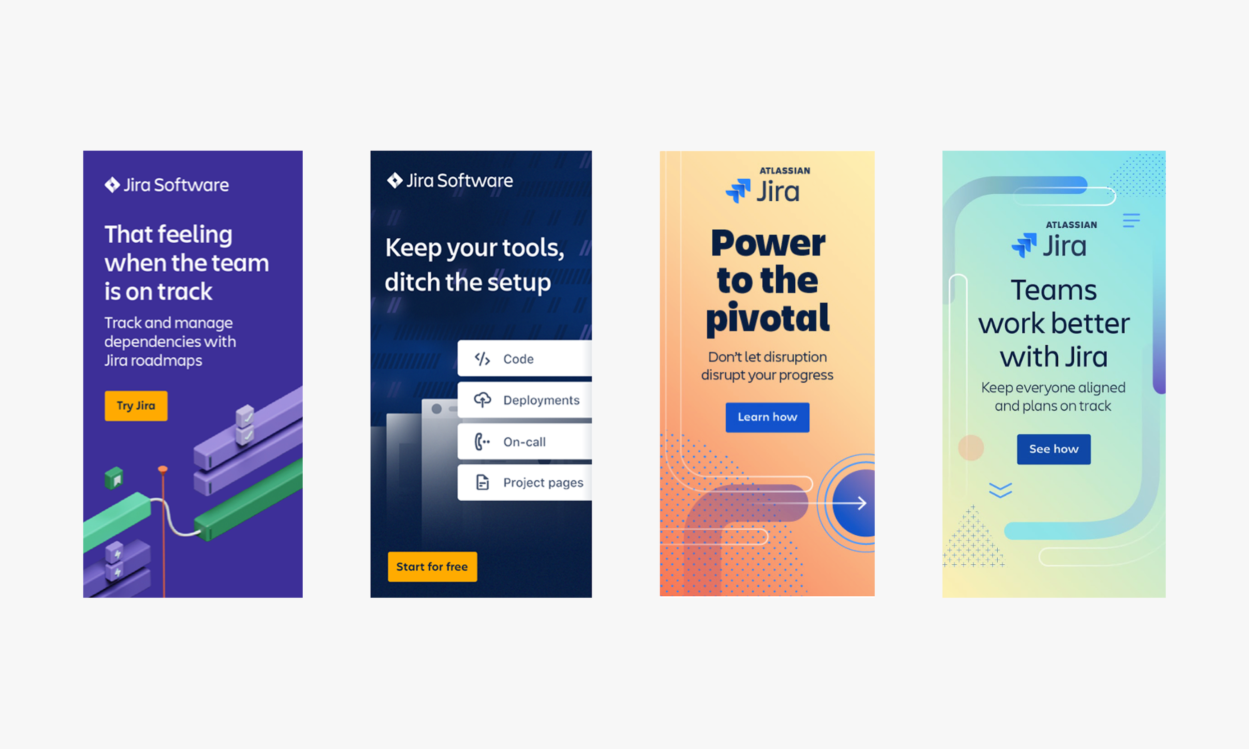
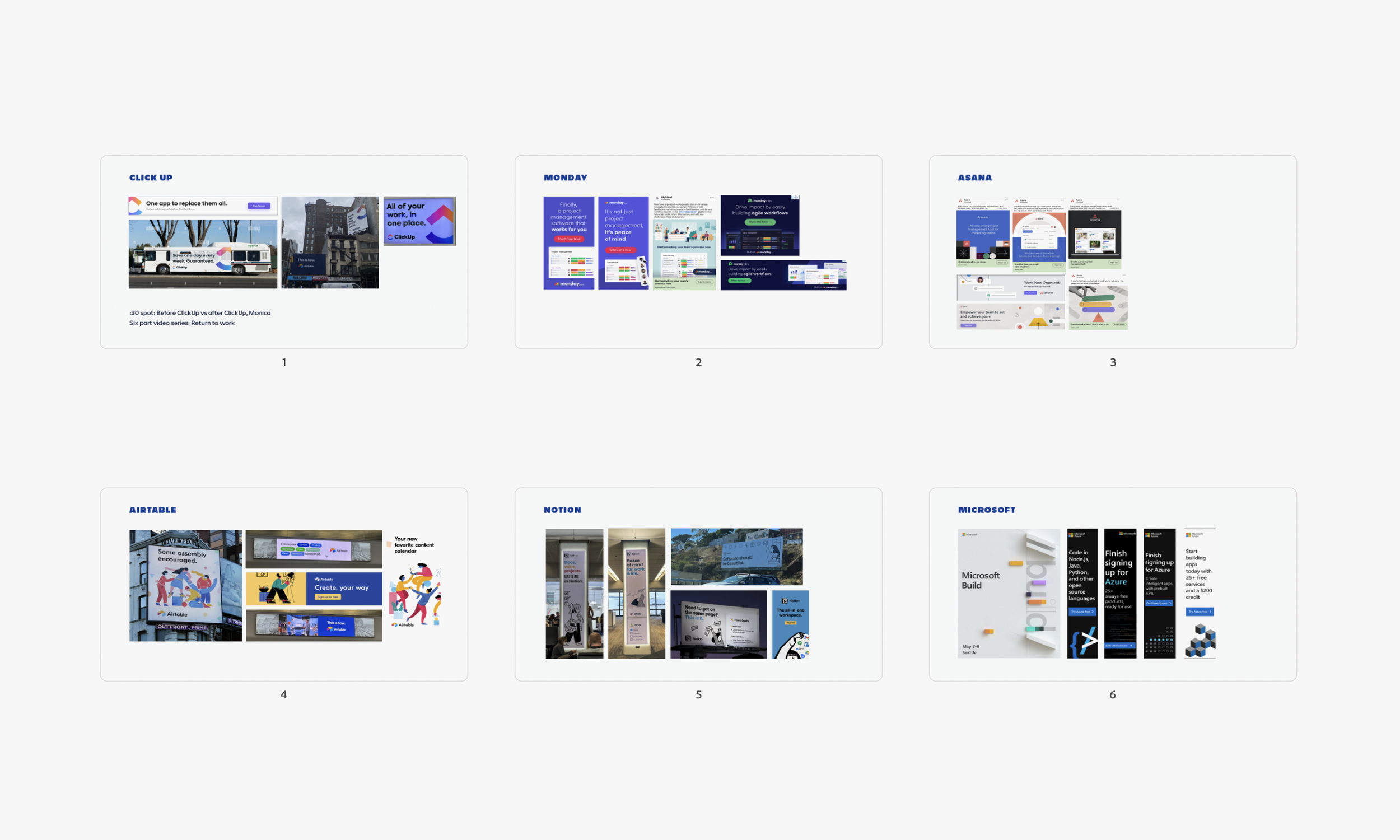
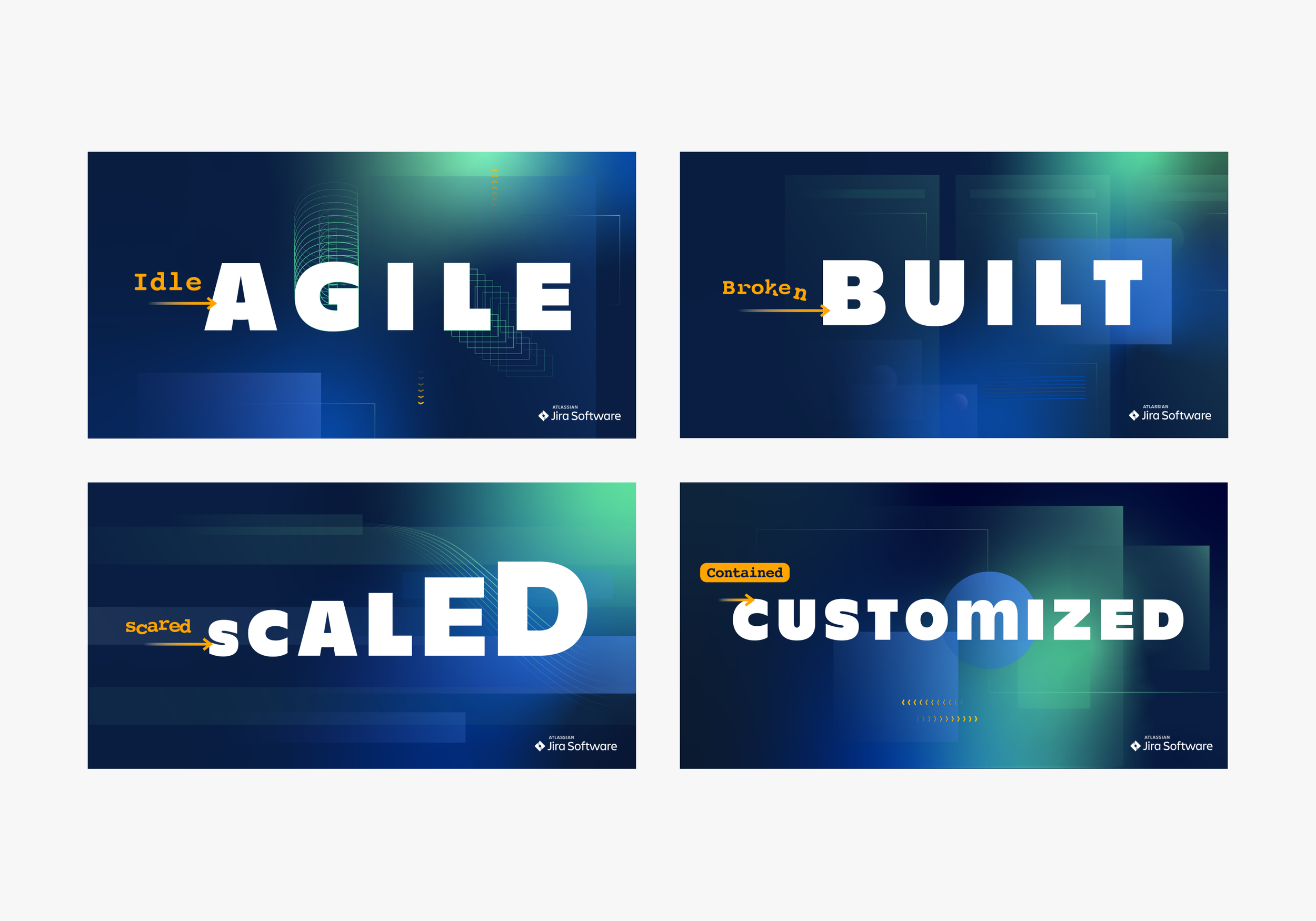
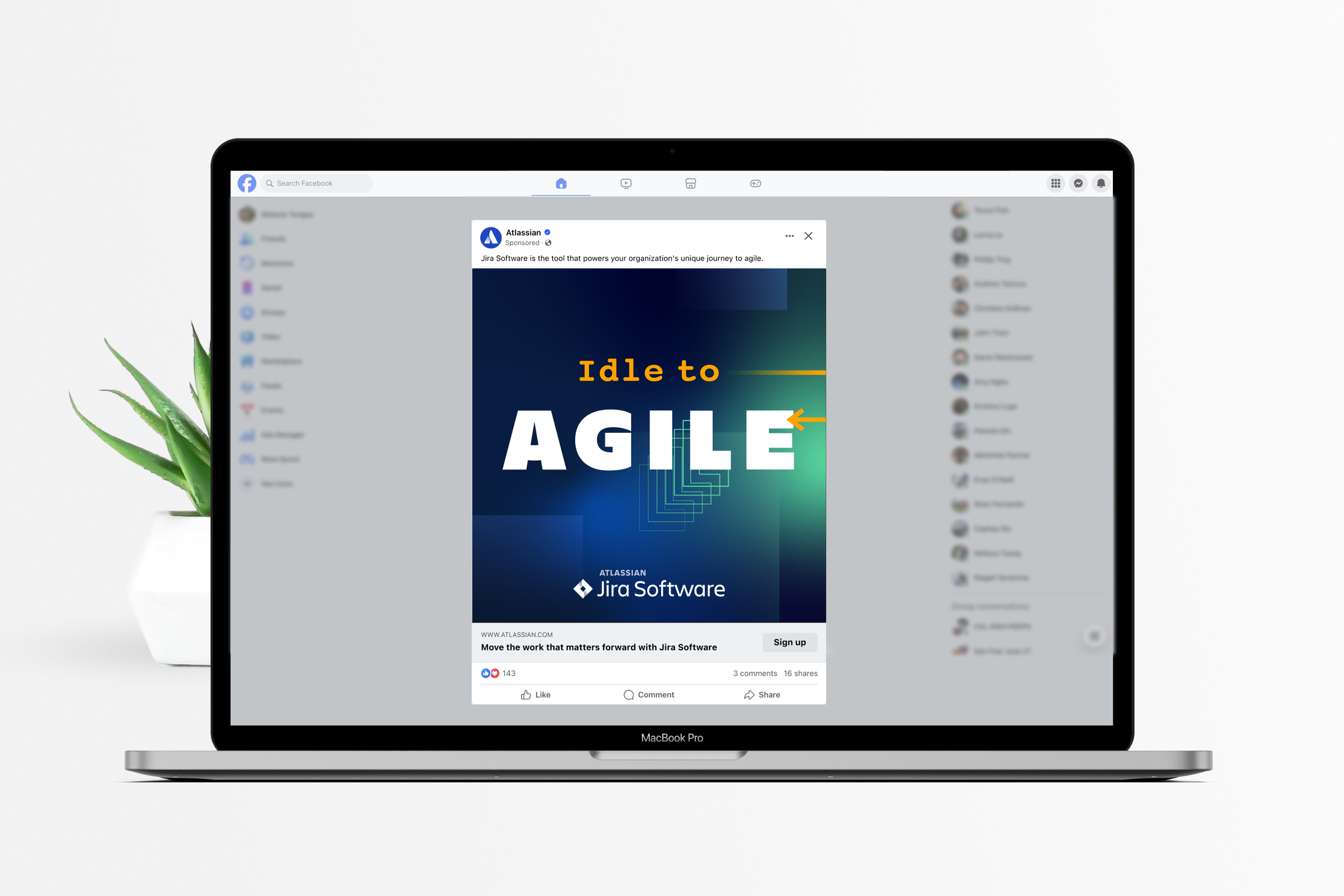
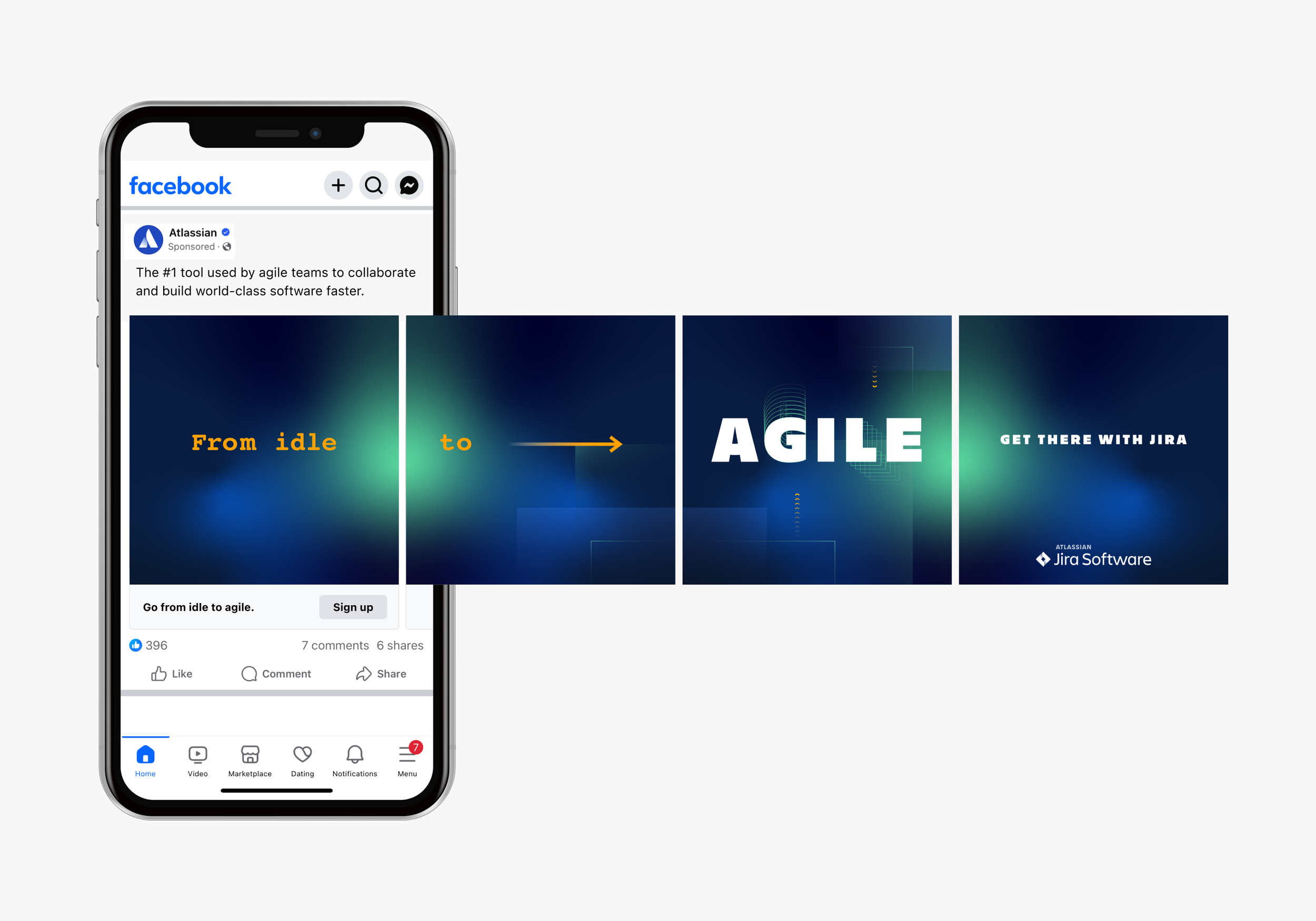
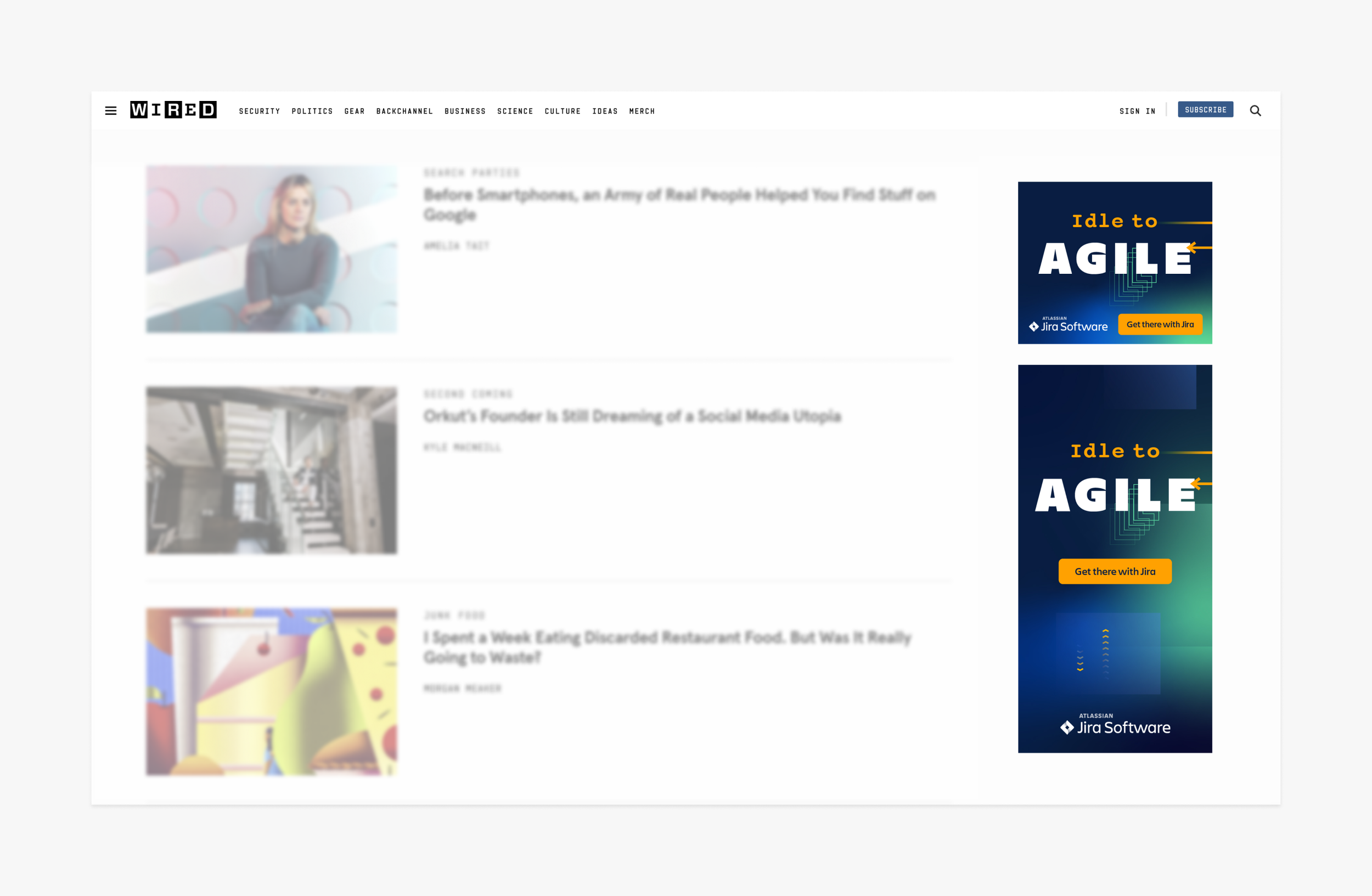
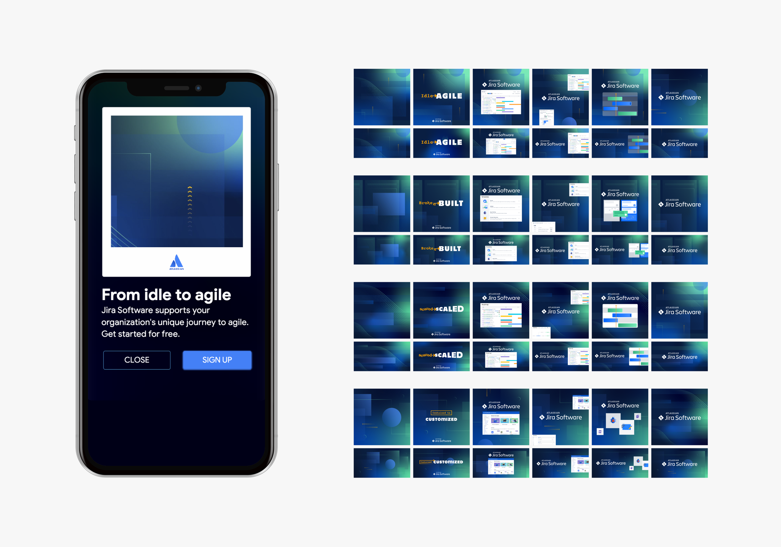
The software project management space is competitive and growing, and a few competitors are positioned as the anti-Jira choice. This Jira Software paid ad campaign highlights its key differentiators and speaks to the pain points users are experiencing with its competitors. The goal, drive new signups and adoption.
The process
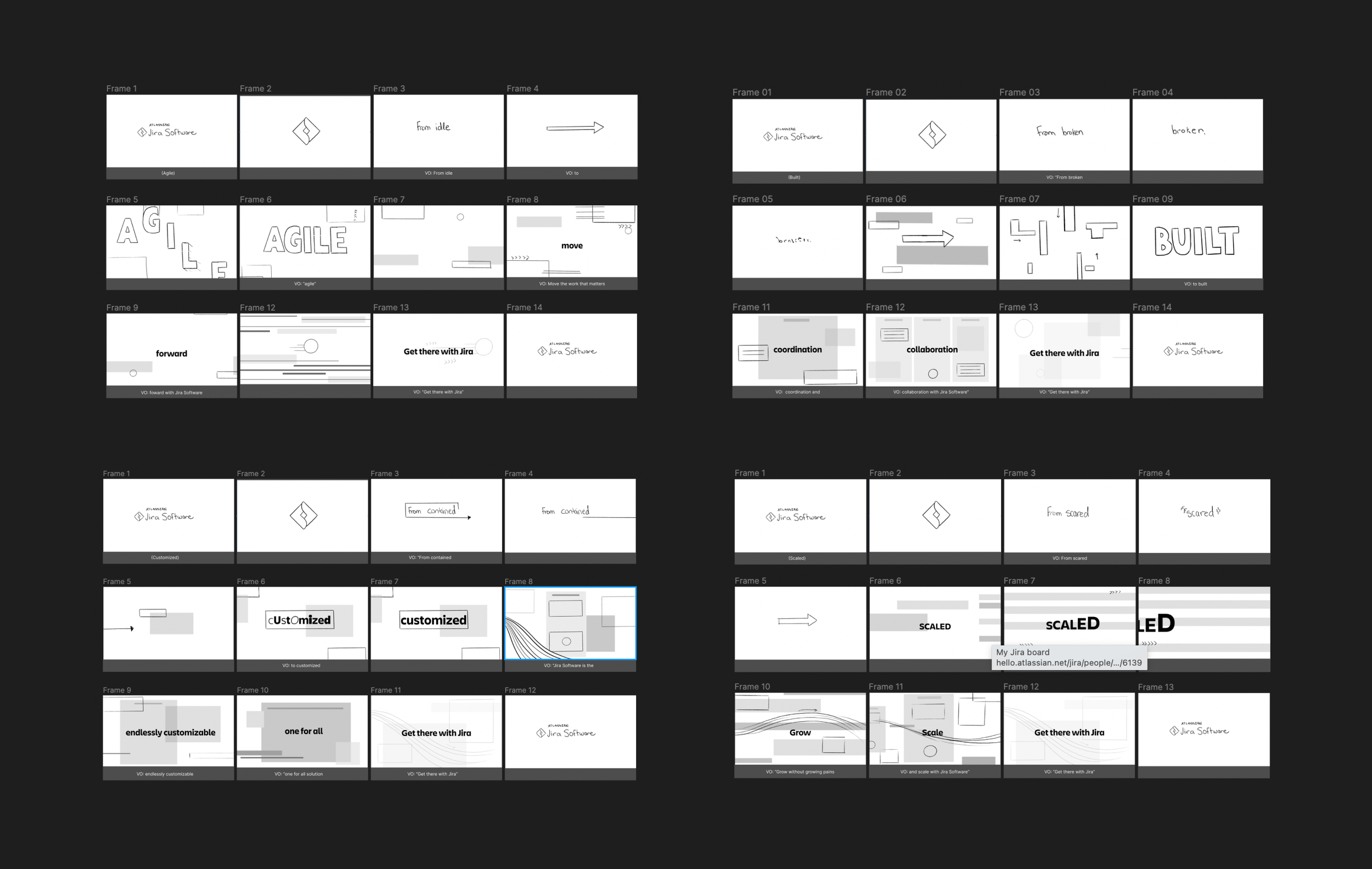
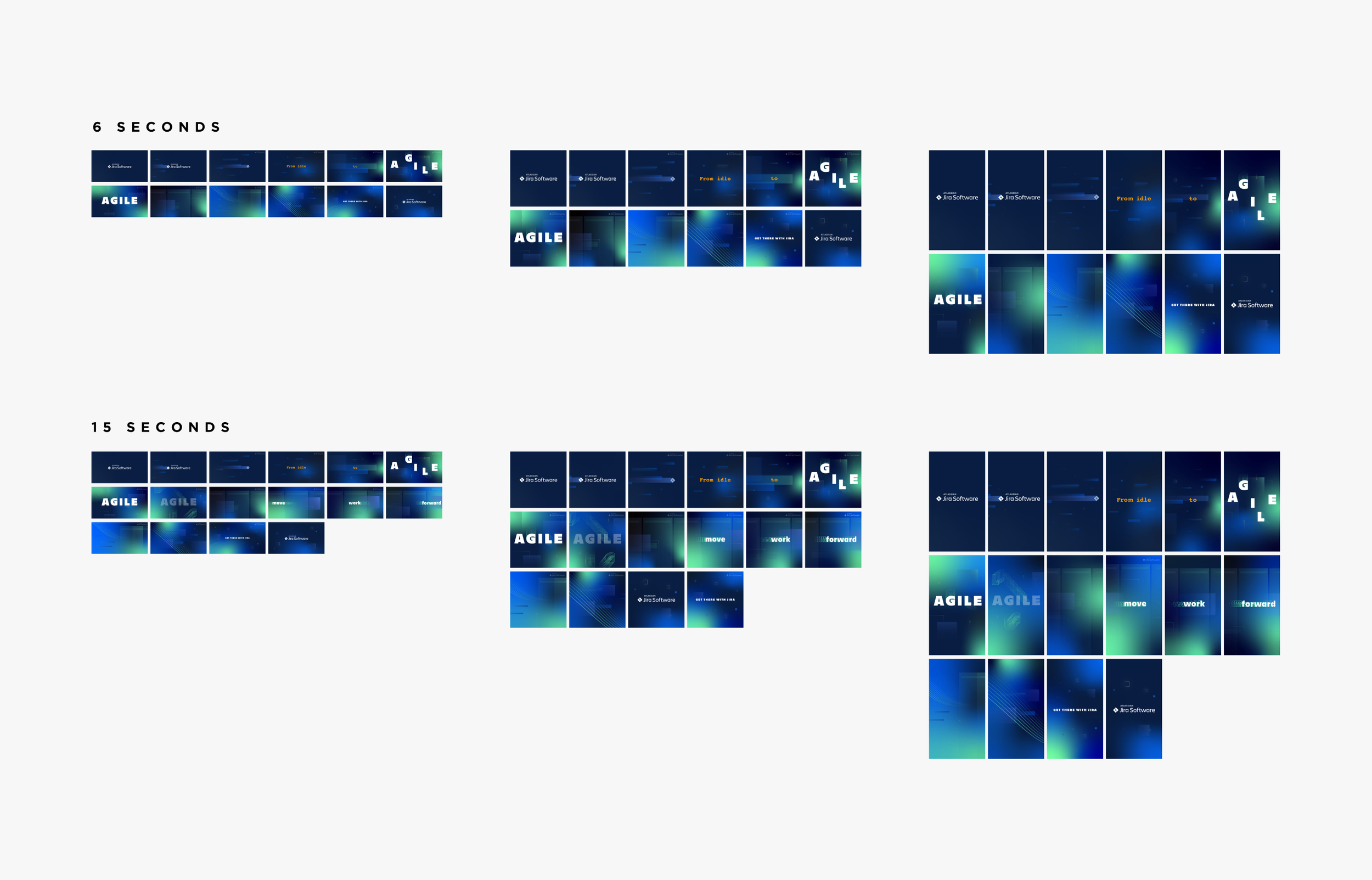
The campaign was centered around Jira Software’s four key differentiators: agile working, scaling teams, collaboration, and customization. We created unique messaging and creative for each of these four categories. Deliverables included static and motion ads, a customer video, and landing pages.
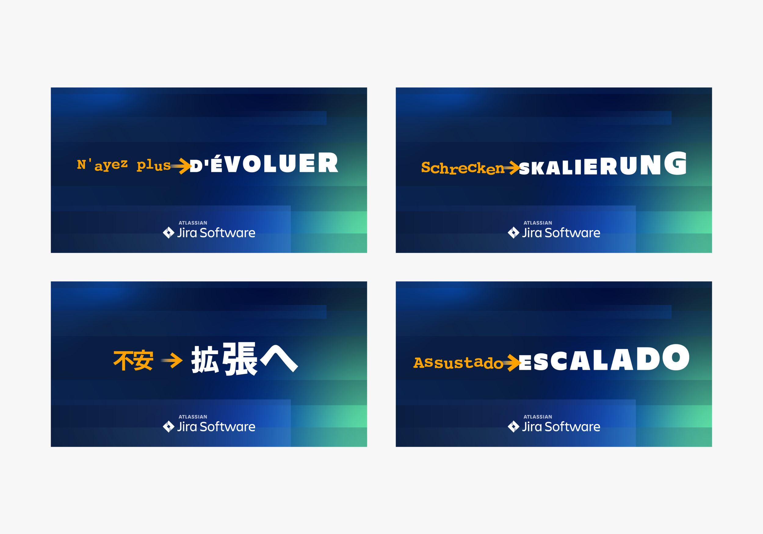
We took a spicier tone for this campaign and used expressive direct copy and visuals. The core ad sets and landing pages shipped first and then we created additional Google responsive ads and localized ads for Germany, France, Japan, and Brazil. We then produced a customer video and refreshed the landing pages to include this valuable testimonial.
The impact
Four months after the campaign launched, evals exceeded the goal by +25% and cost per eval was above plan by +10%.
The "Idle to Agile" ads performed best out of the four themes and Brazil had the most evals at the best cost.
The team
PMMs, copy, design manager, motion designer, art director, localization team
Historical Jira ads: stakeholder want spicy creative, not business as usual
Competitive audit: design and content
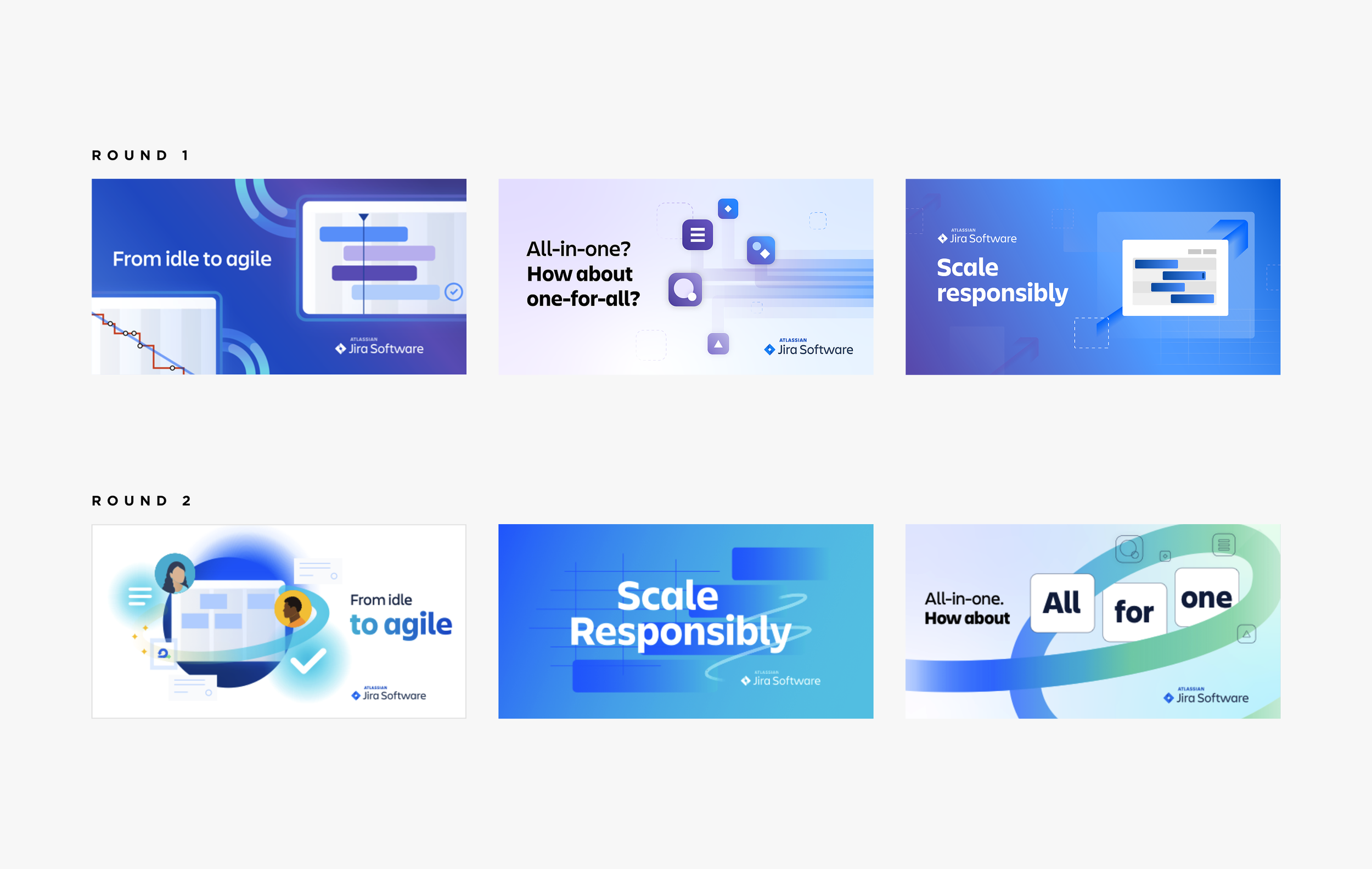
Initial design rounds: not spicy enough for stakeholders
Team alignment: paused on design to align on spicy definition and visuals with PMM stakeholders
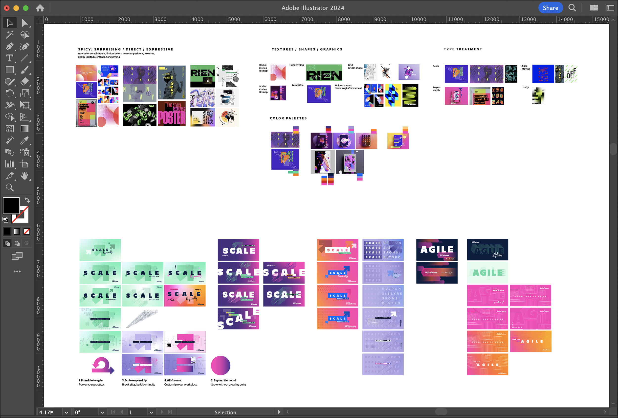
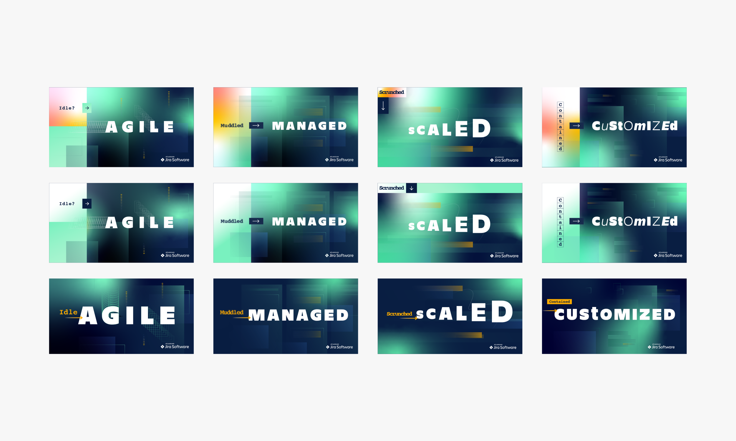
Final direction: used dynamic minimal dark-mode colors as a nod to developers, bold graphic type and abstract product UI; here are the final contenders which varied slightly in layout, color and scale
Final creative: adjusted the color palette to brand colors and tailored the same design elements across all 4 categories ad sets to align with the messaging and features
Static social ads: Facebook, Instagram, and LinkedIn
Carousel social ads: for each category and a family set
Google display ads: 5 sizes for each category
Google responsive ads: 20 versions for each category
Localized ads: all category ad sets were translated into French, German, Japanese and Portuguese
Storyboards for animated ads: we also created animations for all four categories
6 and 15 second videos: the two length videos were created in three dimensions for all four categories
Final animation: for agile working category
Final landing pages: one for each category, updated later to include a customer video
Final customer video: provided agency with style frames
Refreshed landing pages: 3 breakpoints with video
Final campaign
Overview
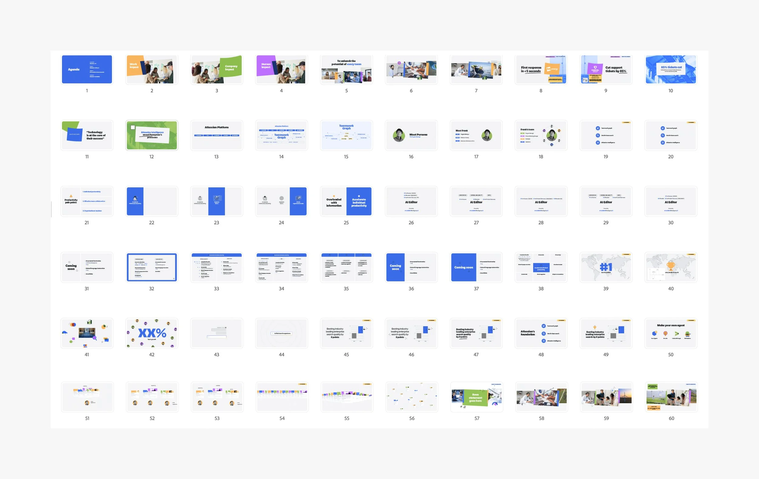
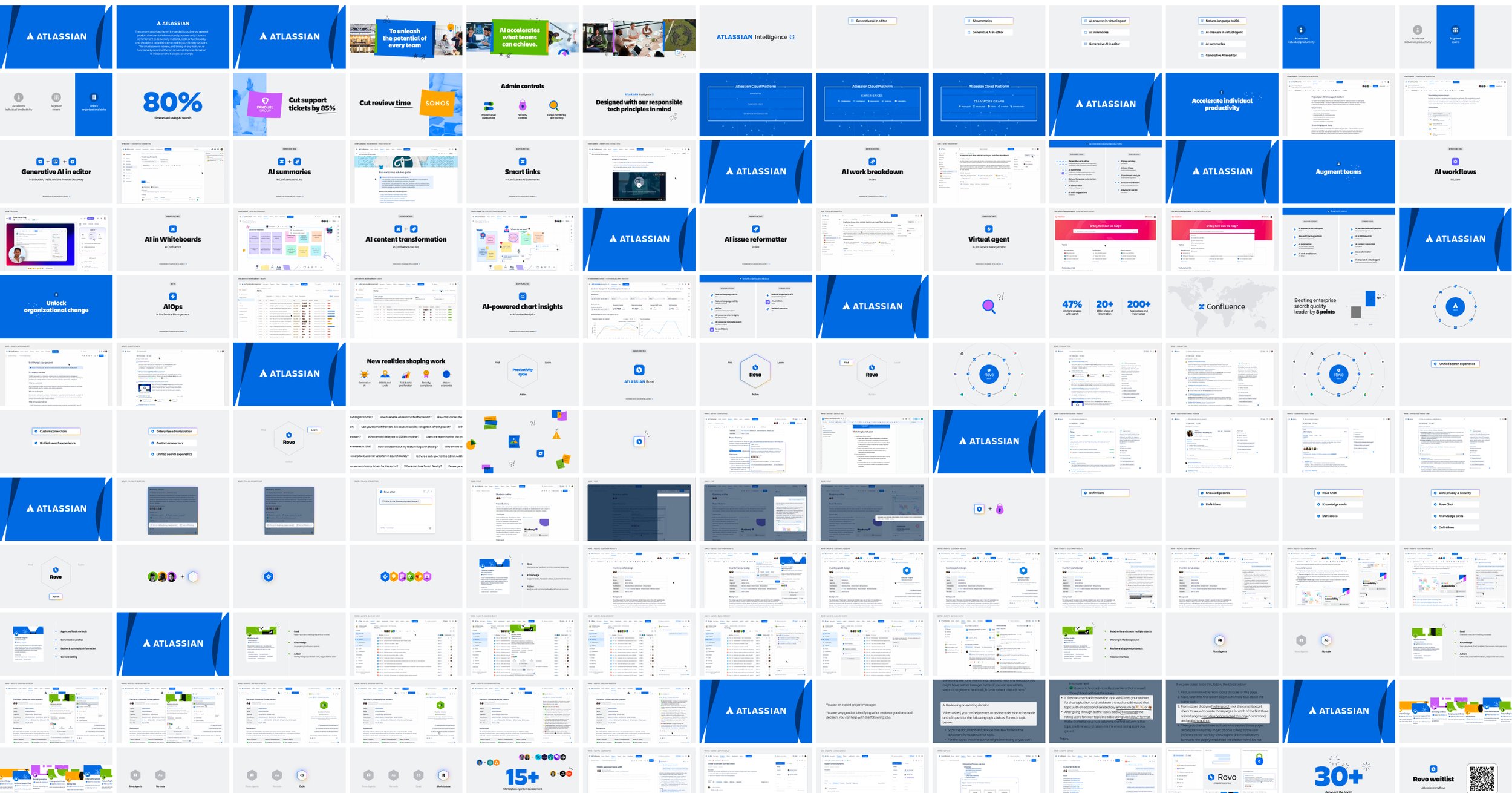
The Creative and Motion teams created a 60-second Atlassian Intelligence GA video to globally debut at Atlassian's technical market event Unleash as well on the company's website, blog, and socials.
The video demonstrated how AI helped teams get work done and unlocked their full potential without being replaced by AI. The video was produced in horizontal and vertical versions.
The process
The project kicked off 6 weeks before the GA. This was the team's first motion project working with the new CMO, new AI product positioning, and new brand refresh, so the project was nuanced.
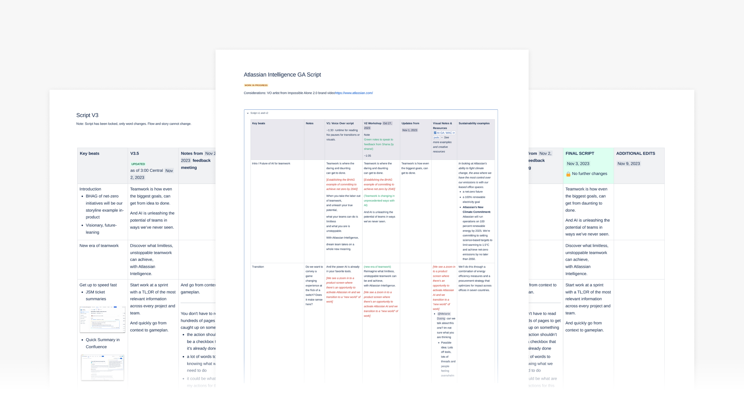
I led the visual design on this project and worked closely with the motion team from kick off to launch. We went through countless iterations of the script, VO, and music selection.
In the end, the final script highlighted three major features and told a sustainable bike-to-work narrative. And, in the final hours, the robust visuals were minimized to reallocate time to the product storyline.
The impact
The final video received 15k+ views on YouTube in less than 6 months. The video creative was used on Atlassian Intelligence's product page, blog annoucement page, emails, and socials.
The team
Motion designers, motion producer, art director, PMMs, voice talent
Script iterations: collaborated with internal teams to establish sustainability narrative, VO and music
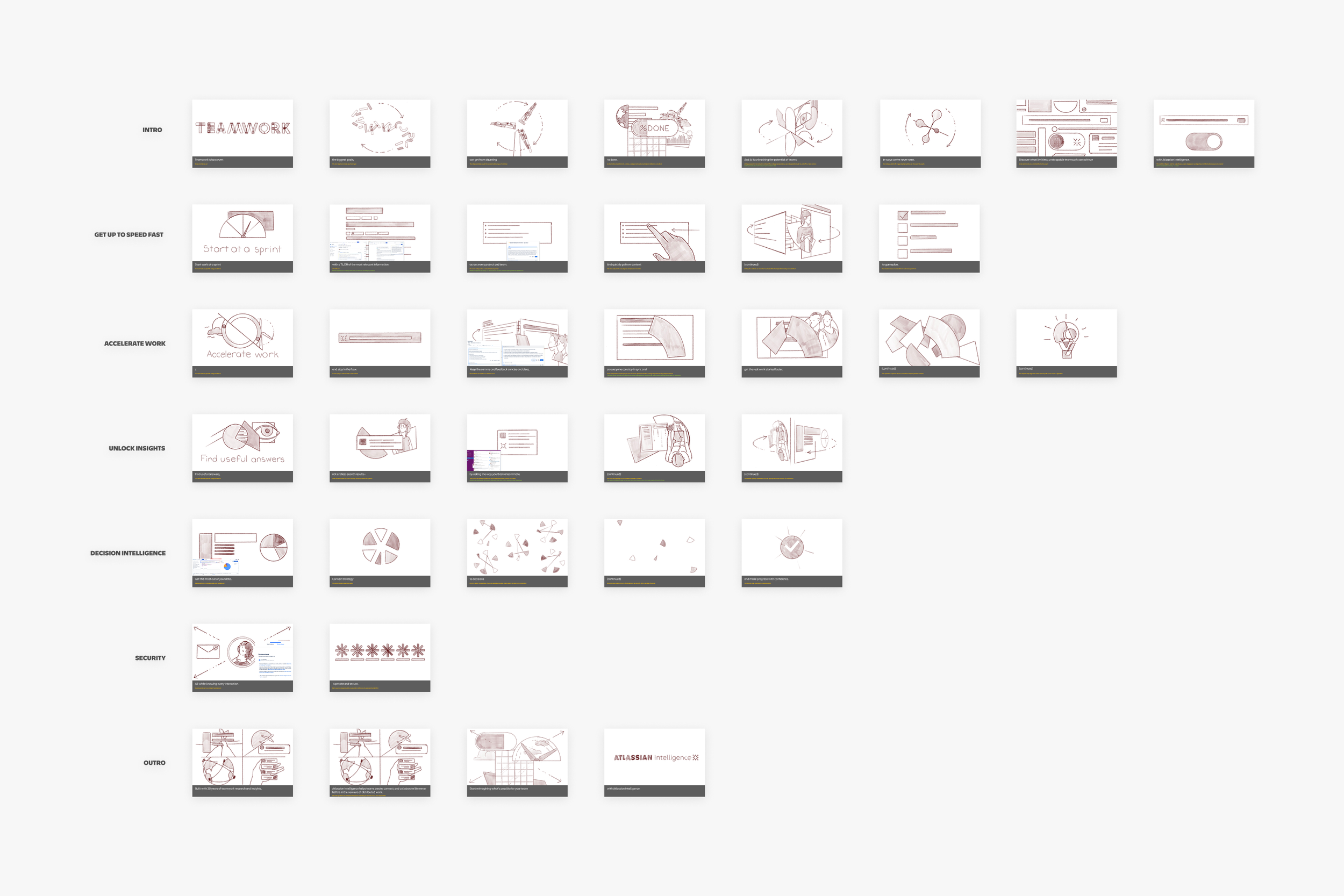
Storyboards: brainstormed with the motion designer to create final boards
Storyboard to style frames: took inspiration from the storyboards, so final frames often varied from the initial sketches
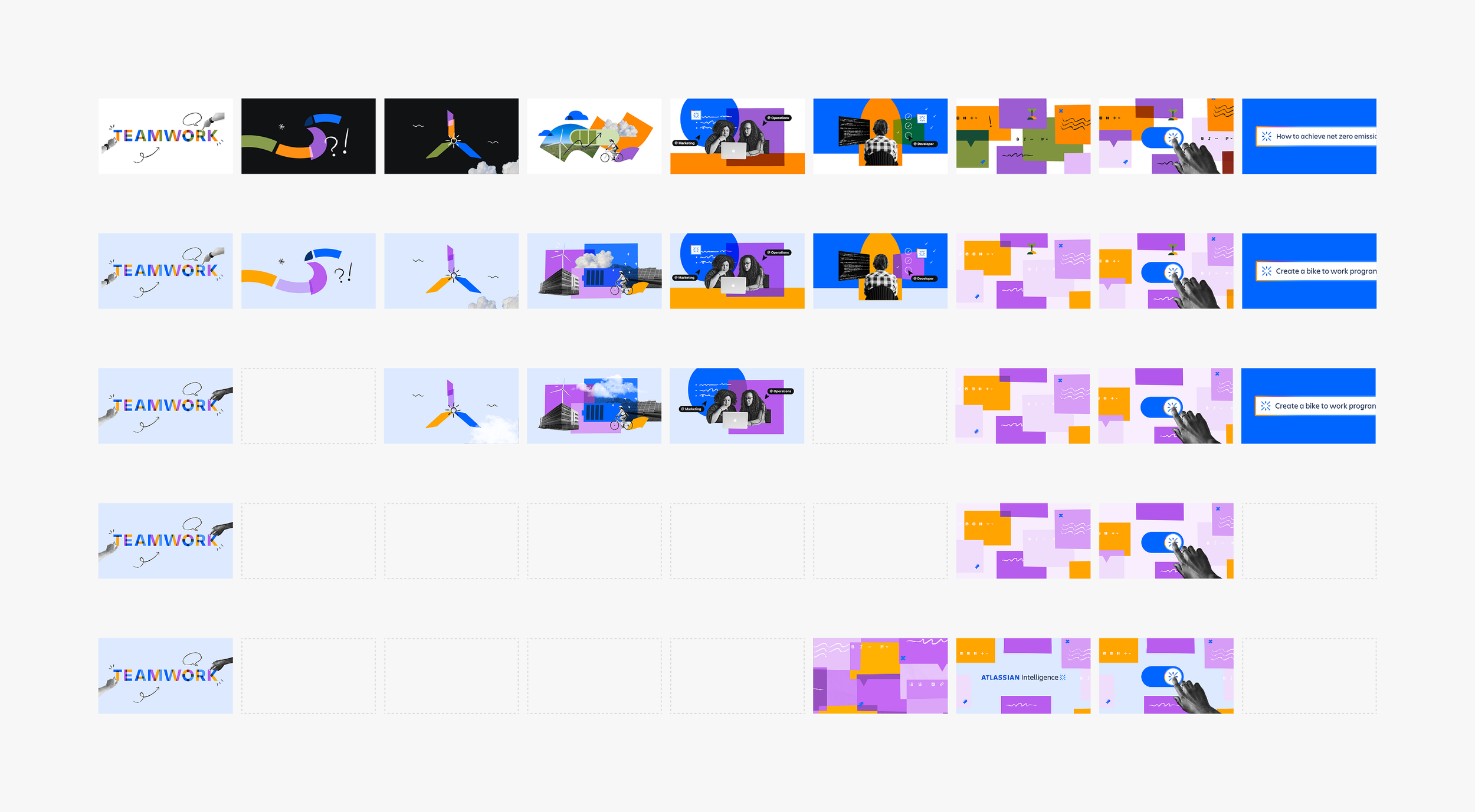
V1 style frames: frames initially included a robust intro and outro, section dividers, and varied color usage
Style frame iterations: the visual narrative changed quite a bit in this phase
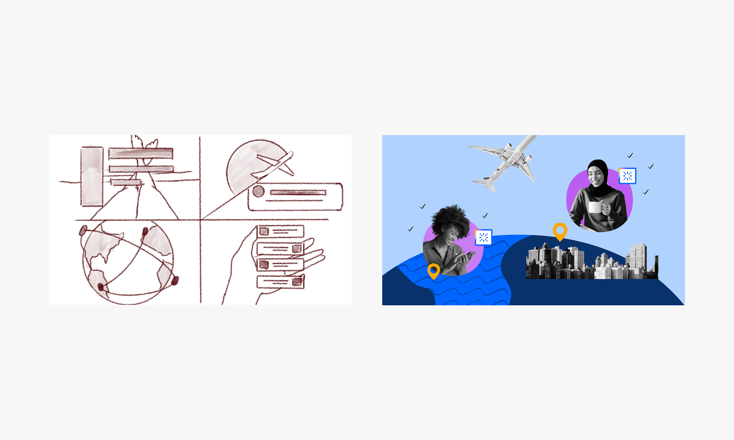
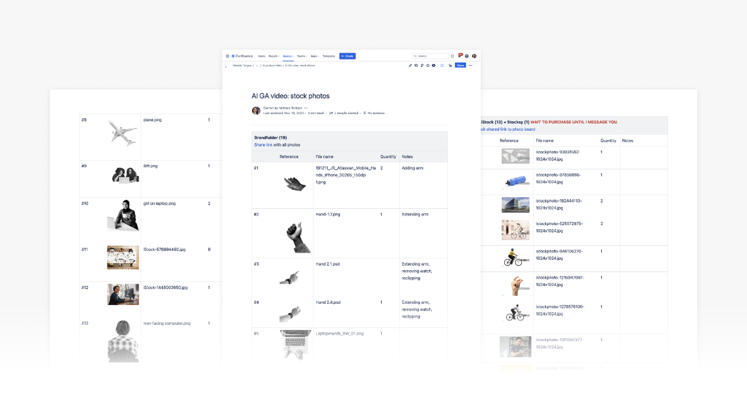
Photo sourcing: leveraged existing photos from our DAM library on Brandfolder and sourced new stock photos. All photos were documented and new photos were purchased by our DAM librarian.
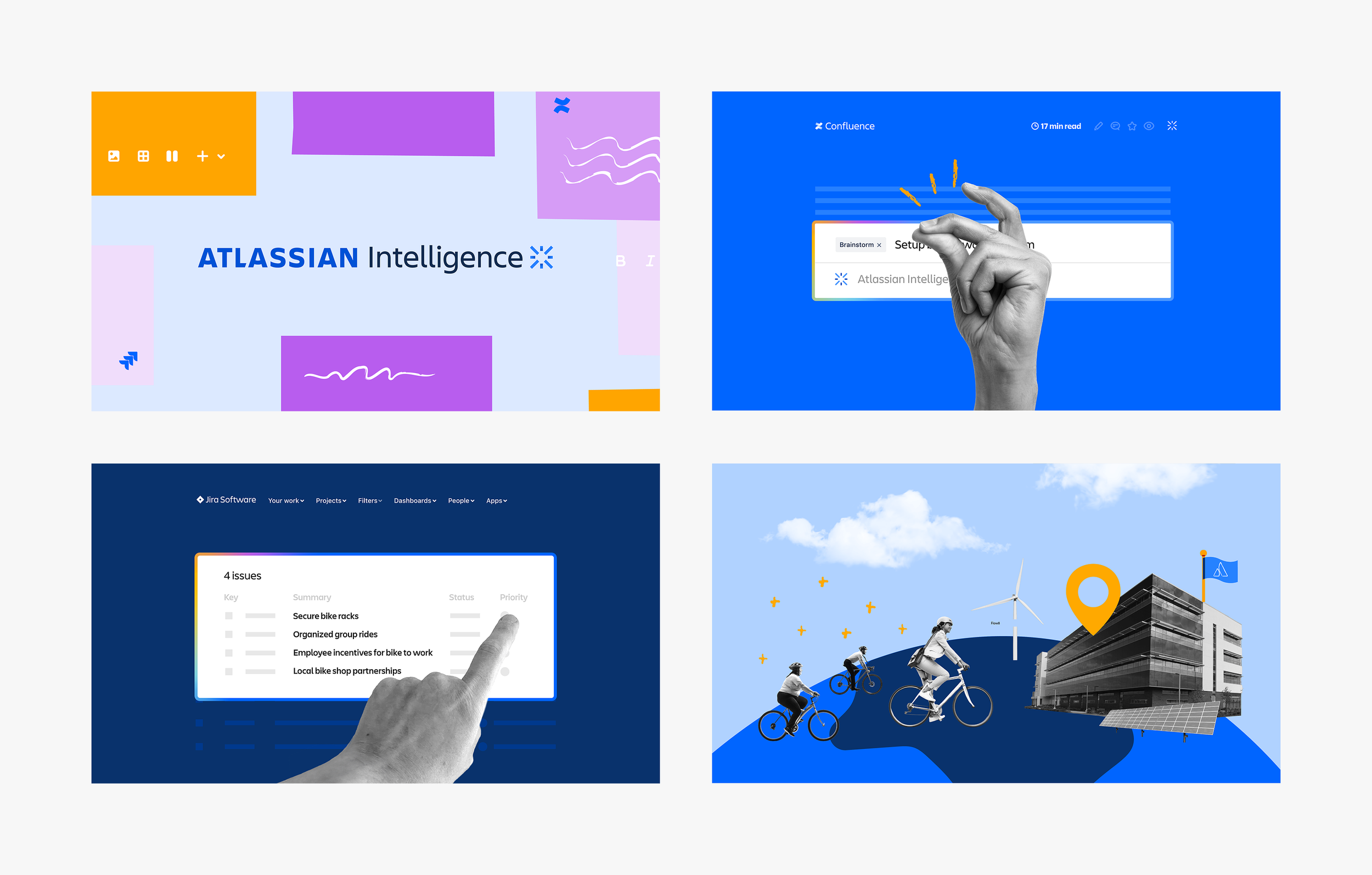
Final video look and feel: leveraged new brand colors, illustrations, and collage style
Final key frames: the video had a systemized color story. The intro and outro were in full color and the product pages showcased a blue palette.
Final style frames: the intro and outro frames were streamlined in order to tell a more robust product story
Watch final video
Overview
TEAM is Atlassian’s largest annual marketing event that brings the community and customers together for the latest news about its teamwork products and platform.
The 3-day event took place at The Venetian Resort in Las Vegas and captured over 4,000 in-person attendees as well as thousands more virtually online. The event kicked off with an Opening Keynote and then followed with 7 topic-driven Super Session Keynotes (2023 had 3 market-focused Keynotes).
The process
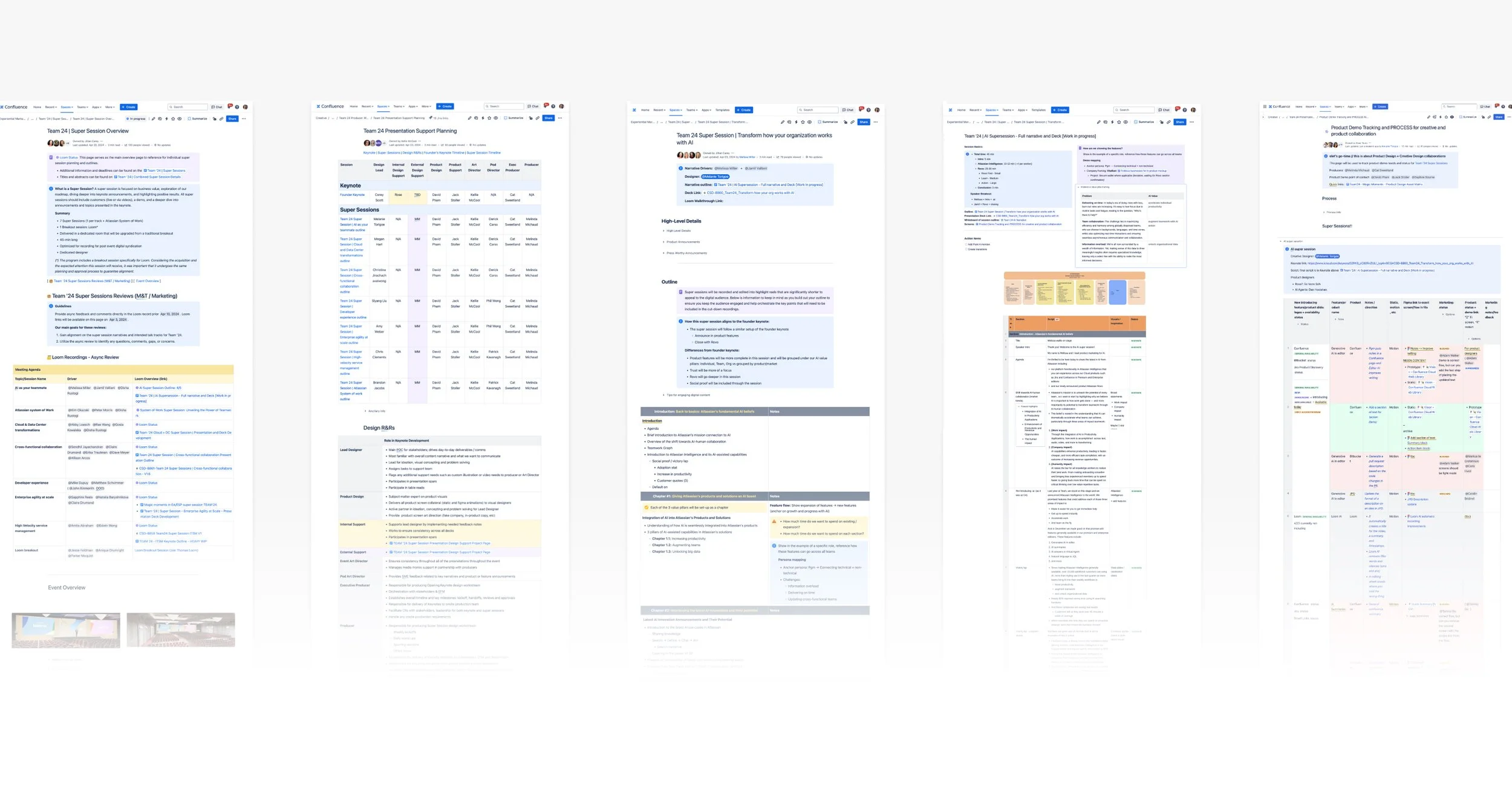
I produced the AI Super Session Keynote, “How to transform your team with AI”, which showcased Atlassian Intelligence’s latest feature updates and the further unveiling of its newest AI product, Rovo. The 45-minute main stage presentation was available to thousands of in-person and online attendees.
Melissa Miller, Product Marketing Senior Team Lead, opened the Keynote with the latest announcements about Atlassian Intelligence, and then Jamil Valliani, Head of Product for AI, dove into Unified Search and the power of Rovo Agents.
As the AI Keynote owner, I was responsible for collaborating with the 2 speakers to concept, execute, rehearse, and deliver an event-ready deck. This included weekly and eventually daily syncs with the speakers as we developed the script, deck narrative, visuals, animations, and demos.
The AI Keynote overlapped and expanded on the Founders' Opening Keynote, so we worked hand-in-hand with their team to ensure there was consistent storytelling and creative between the two presentations. The process was very iterative. Content changed daily and I worked closely with the speakers to ensure their script was accurately yet artistically being brought to life.
Over the two-month timeline, the nine Keynote designers had daily standups so we could stay connected, ask questions, flag issues, and provide support. We also held several design audits and group reviews with the Creative Director and Head of Design to ensure brand and product alignment.
As the deck visuals came together, I started to connect with the speakers, product designers, and operations to map out and gather up-to-date screens for the presentation demos. The final deck included about 3 dozen demos and static screens. I then created on-slide animations and slide transitions, spliced and placed demos throughout the deck, and fine-tuned final speaker notes and transitions in presentation mode.
The impact
The speakers seamlessly delivered the much-anticipated news without any transition, animation, time, or other technical issues.
The AI Keynote was the top attended Super Session at Team24. The session drove tremendous traffic to the demo booth and the team gathered valuable insights and answered questions from current and potential customers.
About a week after the event, the Rovo webpage had about 7k unique visits, 1.2k Rovo waitlist signups, and 14.7k Rovo blog pageviews.
The team
2 speakers, product and creative designers, producers, Events Art Director, Creative Director, Header of Product
Event branding: the brand team established the look and feel
AI Super Session: partnered with two speakers, Jamil (Head of AI Product) and Melissa (AI PMM Lead), in producing the the “AI as your teammate” Keynote
Alignment and communication: Confluence docs were key in keeping teams aligned across Creative, PMM and Product for the 7 Keynote Super Sessions and the AI Keynote I produced
Part 1, AI Keynote: Melissa set the foundation for the presentation and spoke about the impact AI and human collaboration can have for teams
Atlassian Intelligence: Melissa reminded the audience of the GA features and celebrated the 3x number of customers who are using the product a year later
Speaker partnership: had weekly standing meetingswith the two speakers and we worked on the content and visual narrative in tandem. This part was very iterative as the narrative and features weren’t finalized until a few days before the event.
Keynote structure: key slides like the section dividers, feature introductions, feature availability and product UI demos
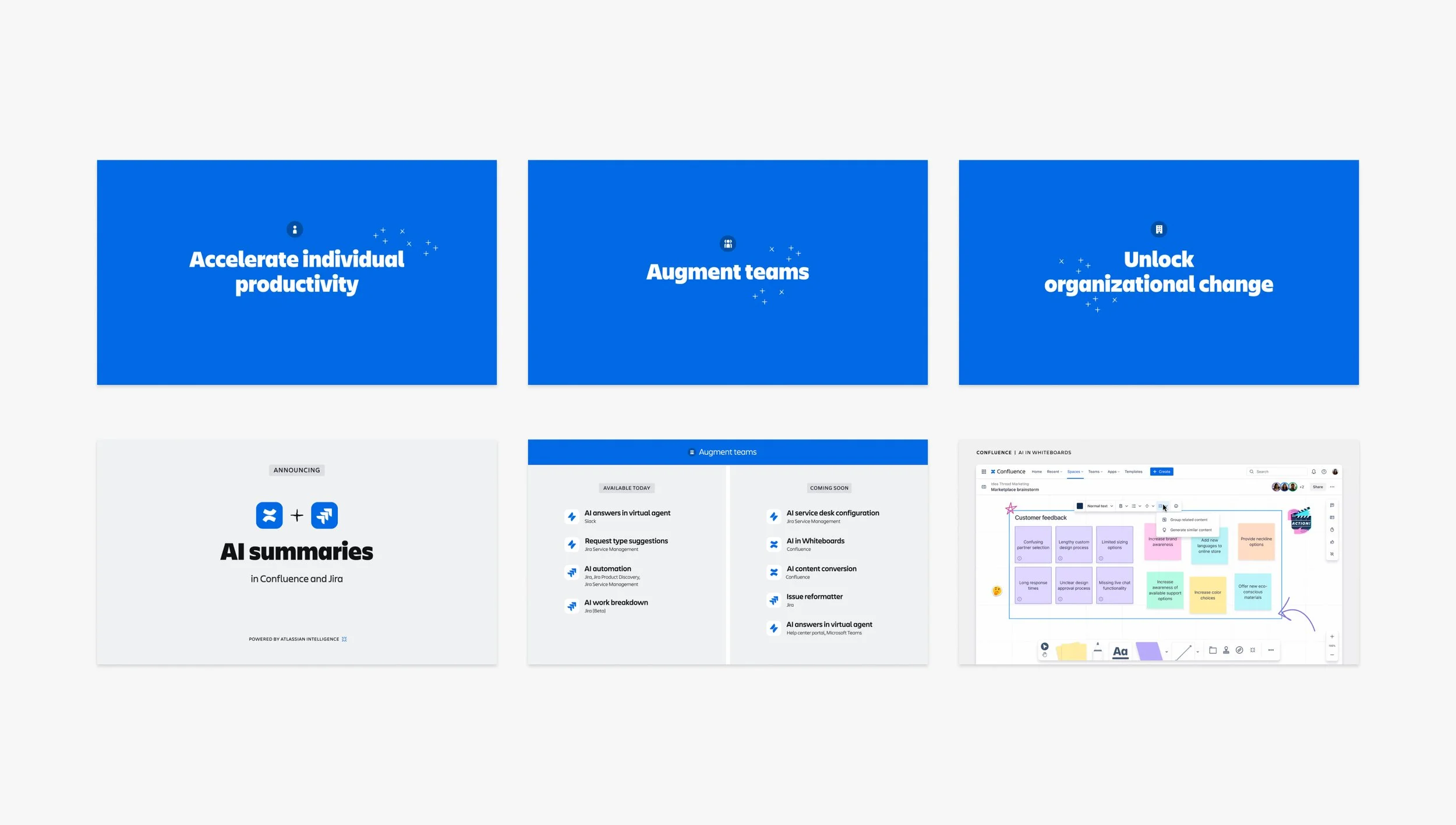
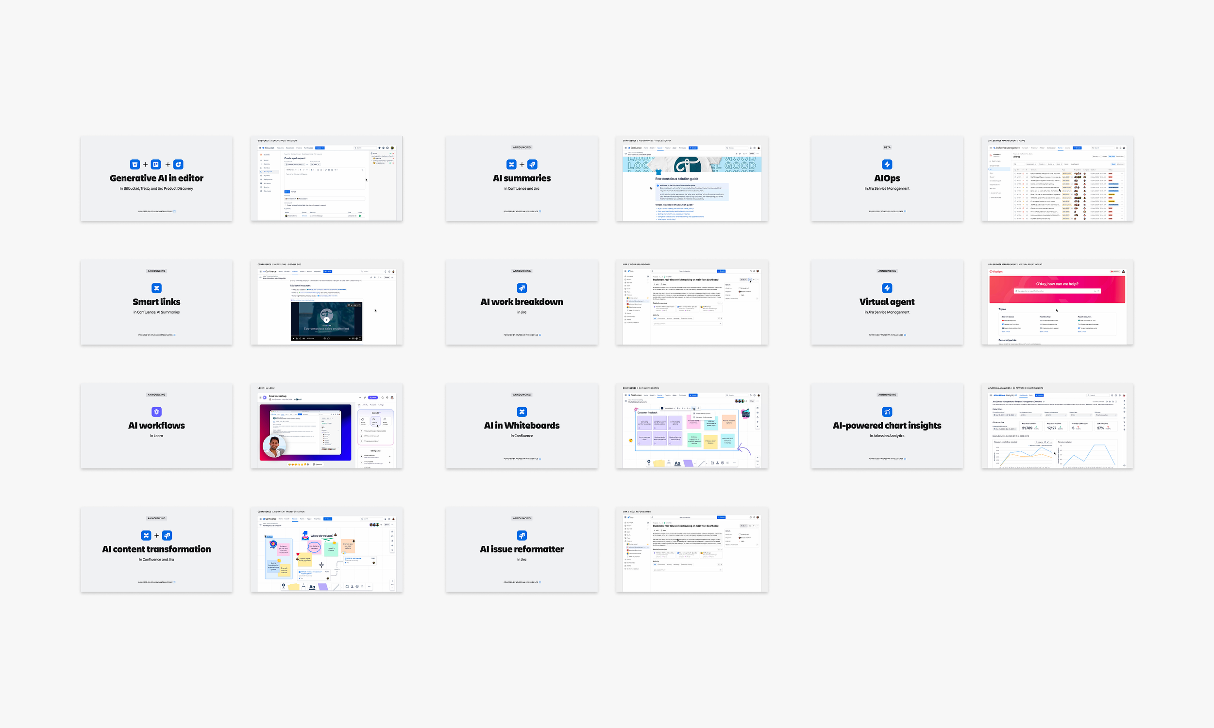
New AI features: Melissa revealed eleven new AI features across Atlassian’s Analytics, Bitbucket, Confluence, Jira, Jira Service Management and Loom
Live AI Super Session: Melissa presented on the Main Stage to the largest audience of all seven Super Sessions.
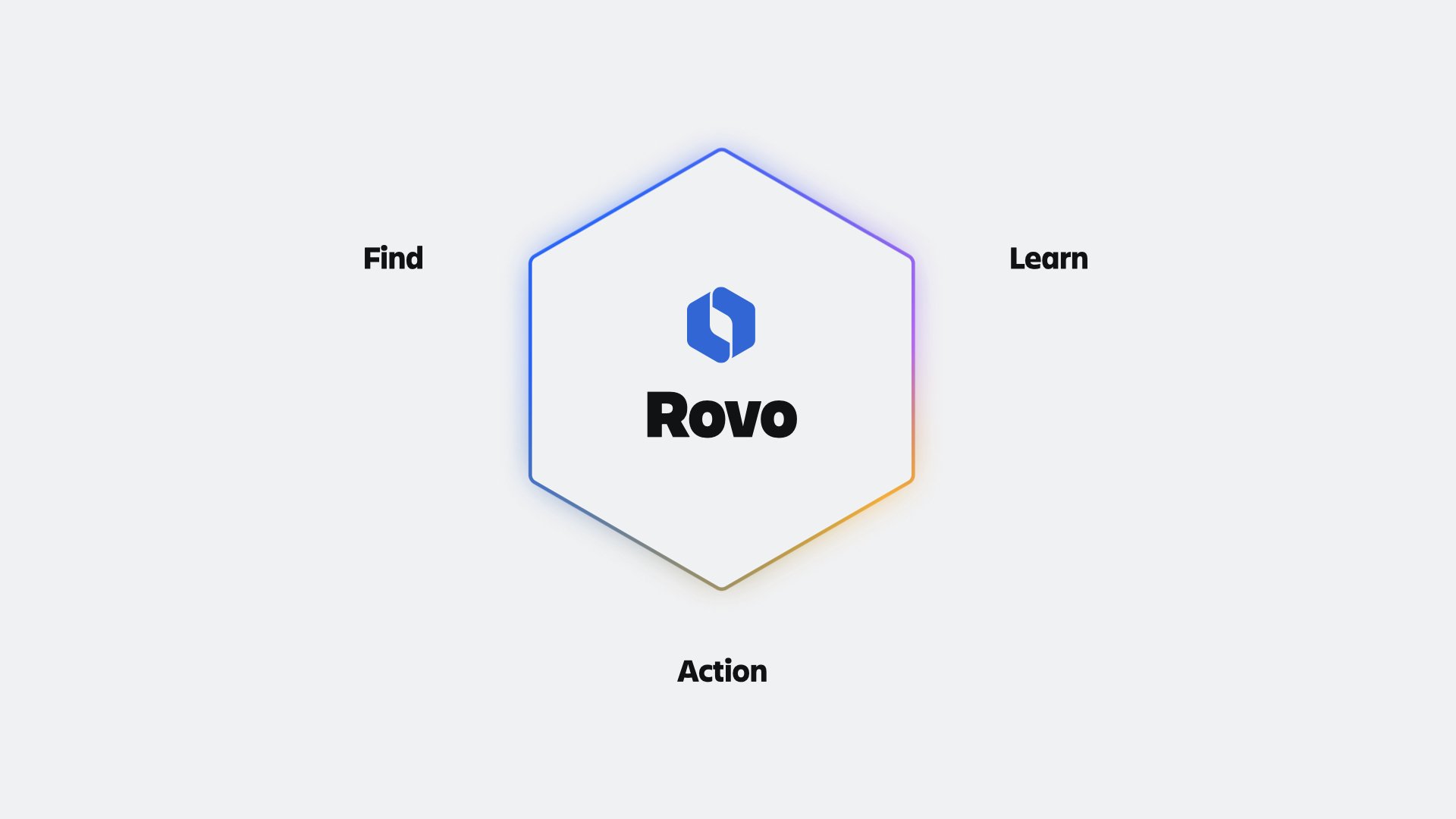
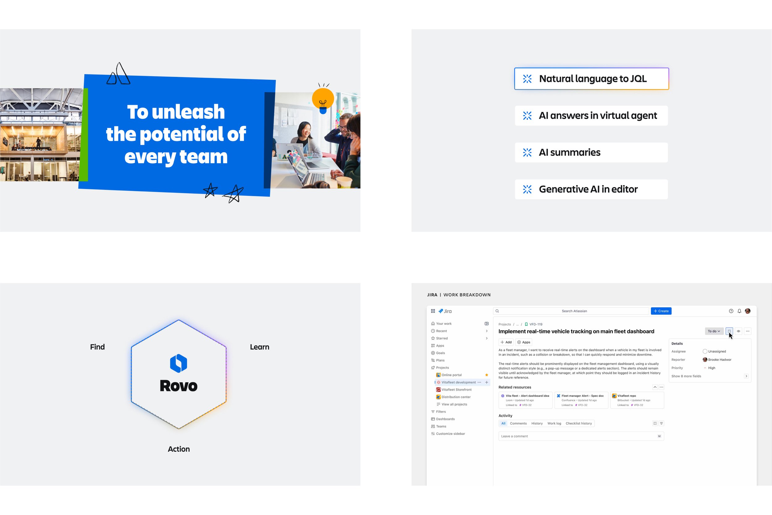
Part 2, AI Keynote: Jamil cured attendees’ curiosity and shared detailed demos of Atlassian’s newest AI product Rovo, which was just annouced in the morning opening Keynote.
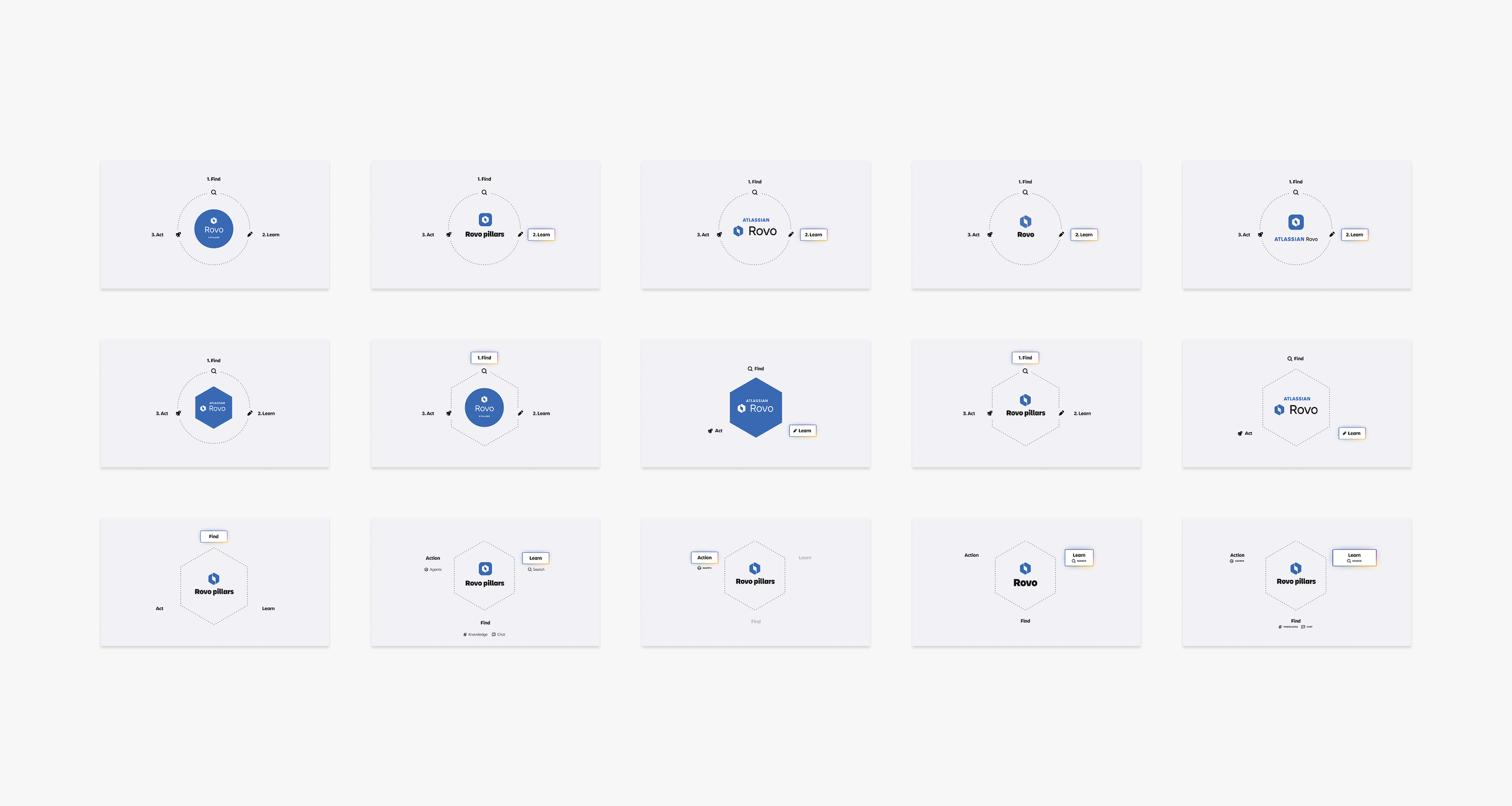
Rovo pillars: created this animated diagram that set up the product narrative in the AI Super Session and Opening Keynote
Live Opening Keynote: Mike Cannon-Brookes announcing Atlassian’s new AI product Rovo
Rovo diagram exploration: looked at a number of arrangements, Rovo lockups, colors and shapes
Final Keynote: 156 slides
Key frame animations: intro, Atlassian Intelligence, Rovo and product demo
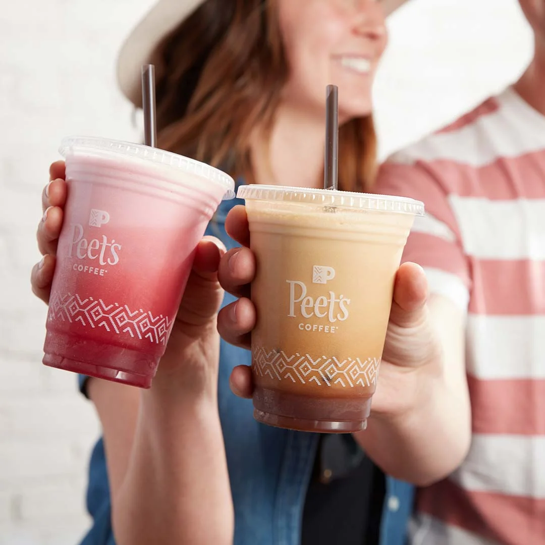
Overview
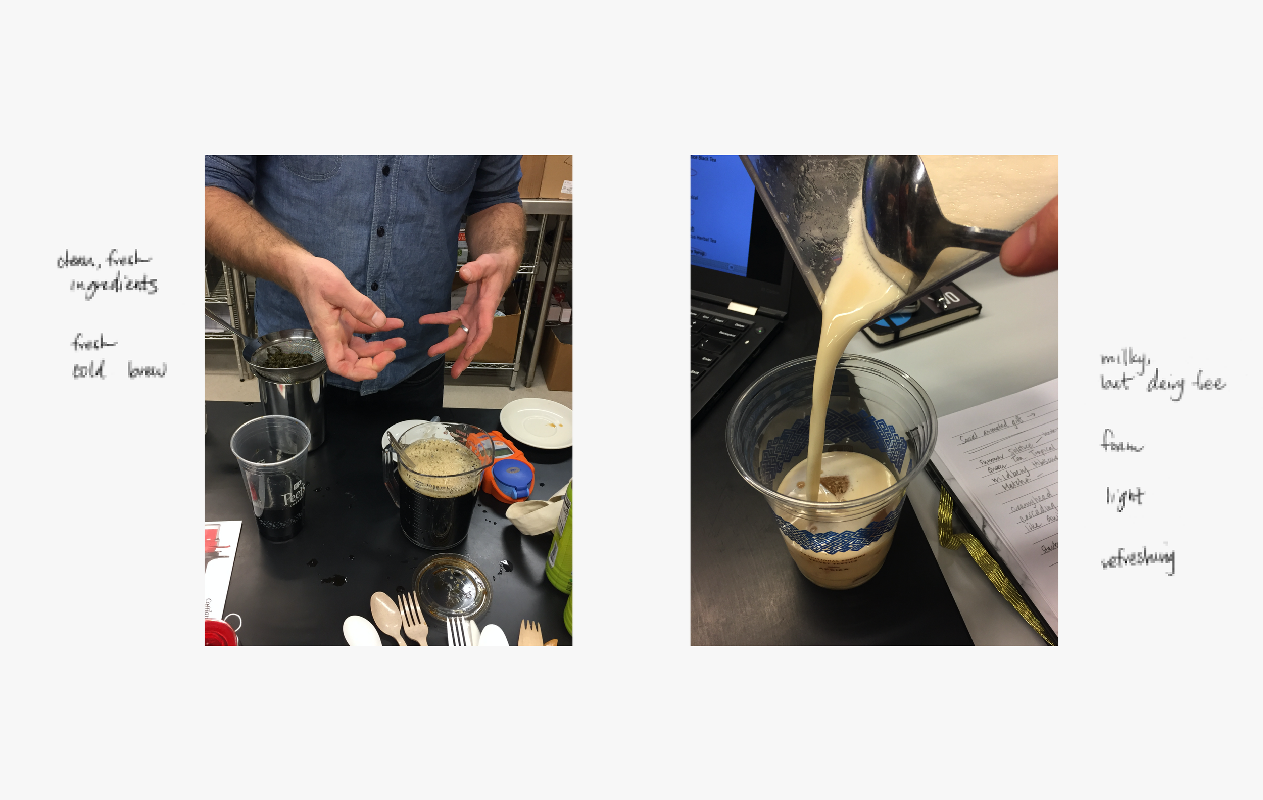
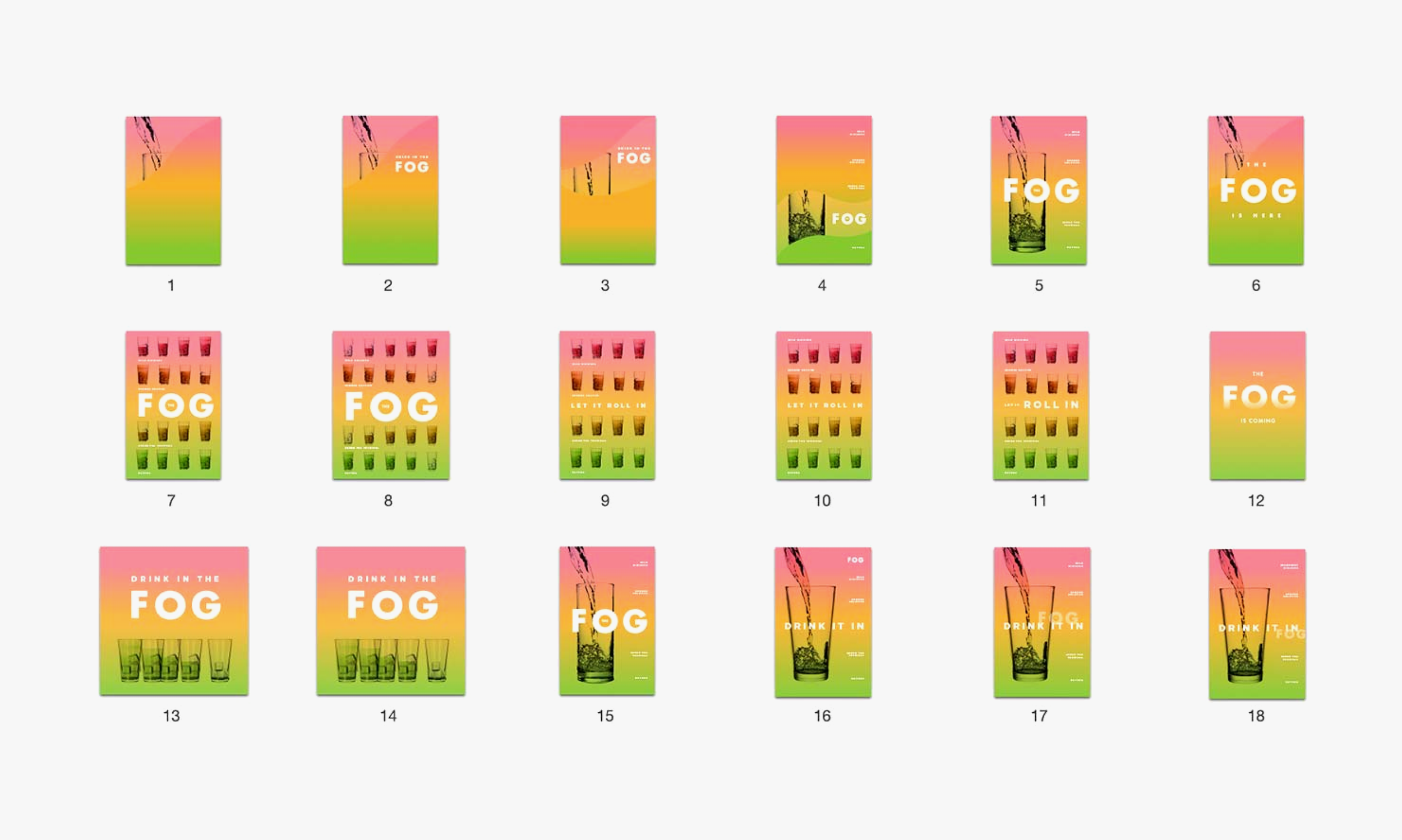
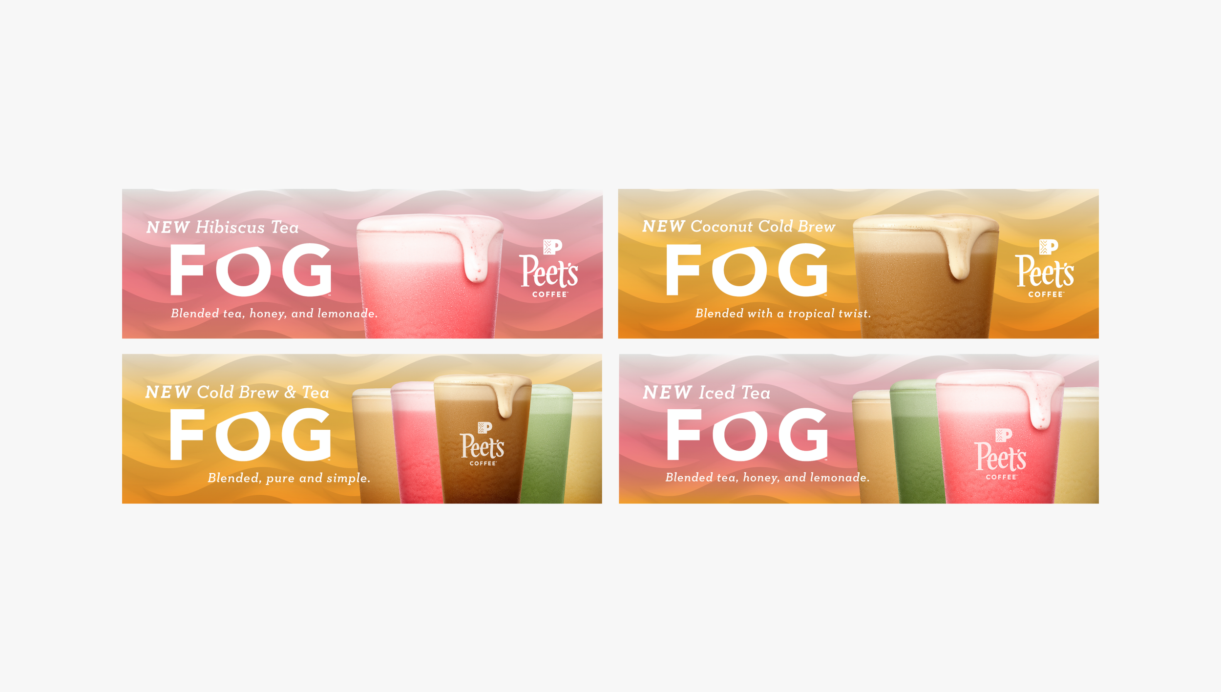
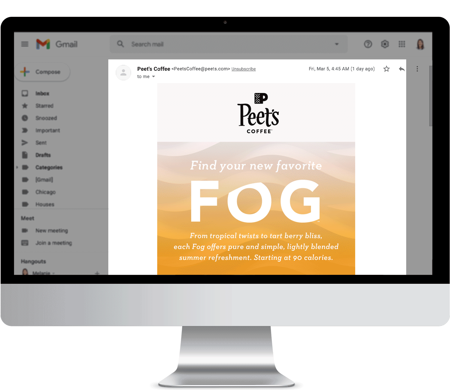
The task was to create a cross-channel summer campaign to introduce Peet’s newest iced beverage, the Fog, and drive traffic to and purchasing in Peet’s coffeebars nationwide. The lightly blended beverage came in five distinct coffee and tea flavors and created a mesmerizing ombre as it cascaded over ice, reenacting San Francisco’s infamous fog.
The process
The Creative team first met with the F&D team to learn about the fresh ingredients. We saw how the blended beverage was made and watched the frothy concoction cascade over the ice. Lastly, we tasted the refreshing light and perfectly sweetened beverage.
Creative research and concepting followed, first individually and then as a group with 2 designers and the creative director. After reviewing all the work, we selected four unique directions to present to the president and leadership team. My creative concept here, with the bold type, hero drink, and fog-like graphics earned the group’s unanimous vote.
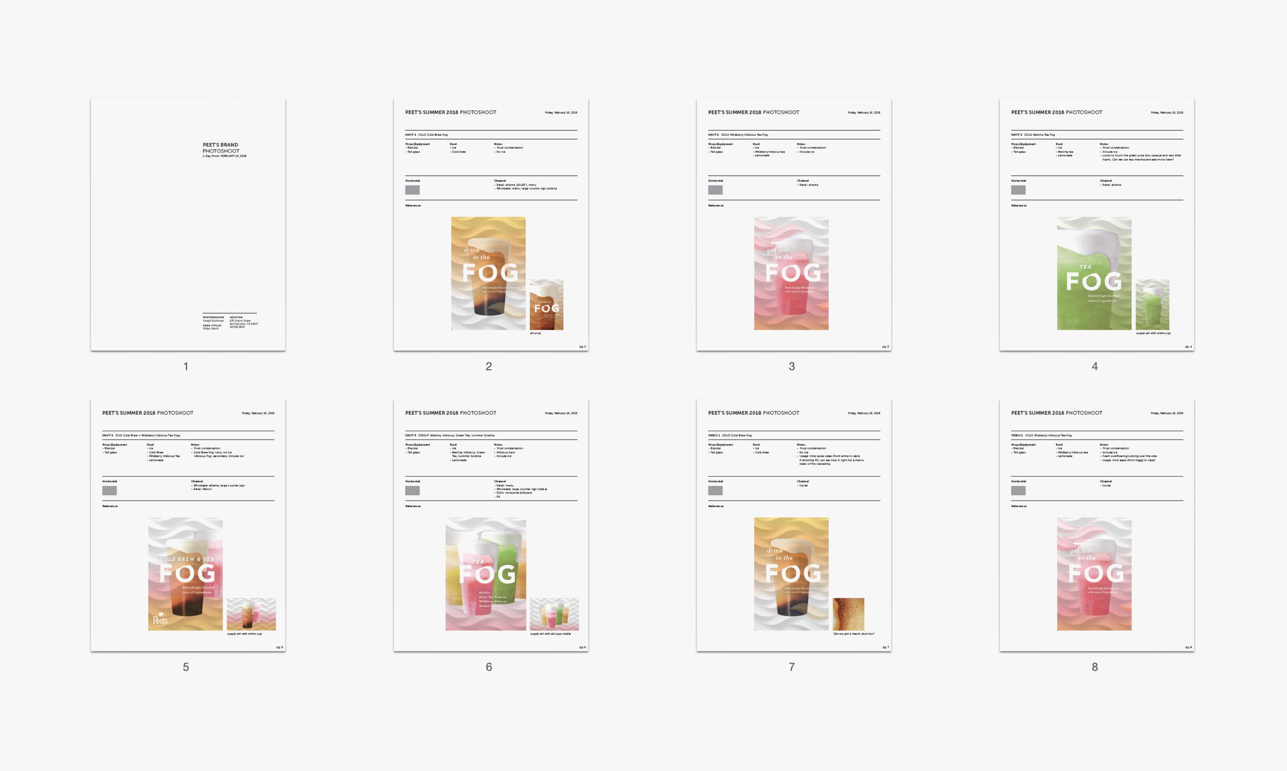
With clear creative direction, we moved into photography. I concepted, art directed and owned the pre and post-production for two photoshoots. We worked with one photography studio for the marketing assets and a second studio for the social photos. I also executed and oversaw all campaign deliverables, providing creative guidance to and partnering closely with in-house designers, the animation studio, and additional vendors for OOH, swag, partnerships, and printing.
Deliverables included billboards, car and subway wraps, an outdoor animation projection, online advertising, retail and wholesale POP, emails, landing page, web, partnerships, events, and paid and organic social (static and motion). I also press-checked all print collateral.
The impact
From kick-off to launch, the creative process took 6+ months, and, by the end of summer, the multifaceted program outperformed plan by +134%.
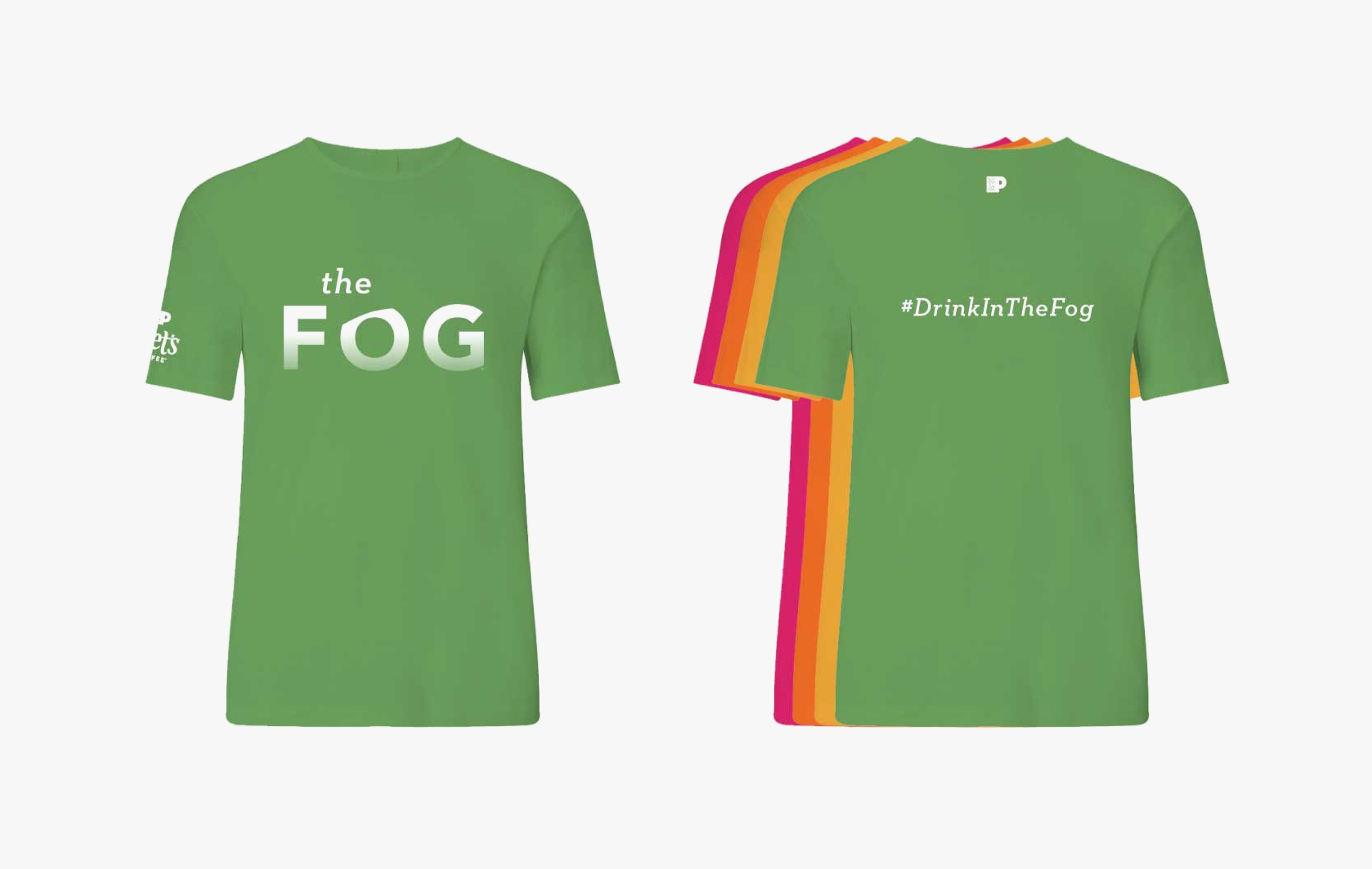
This was the team's largest product launch, so it was rewarding to see the return on unique deliverables such as billboards, bus and car wraps, social animations and city projections (San Francisco).
We also pushed the creative in a new direction, using brighter colors and shapes, and partnered with a new local photography studio and animation studio to capture this playful aesthetic.
The team
President, brand, R&D, marketing, designers, copy, project manager, 2 photography studios, food stylist, photo retoucher, animation studio and printer
Summer theme: the pillowy beverage was named after the San Francisco summer fog and featured a colorful tea and coffee lineup
R&D session: learned how the beverage was made, tasted the light blended beverage and witnessed the mesmerizing cascade
Fog lineup: four Iced Tea Fogs and one Cold Brew Fog
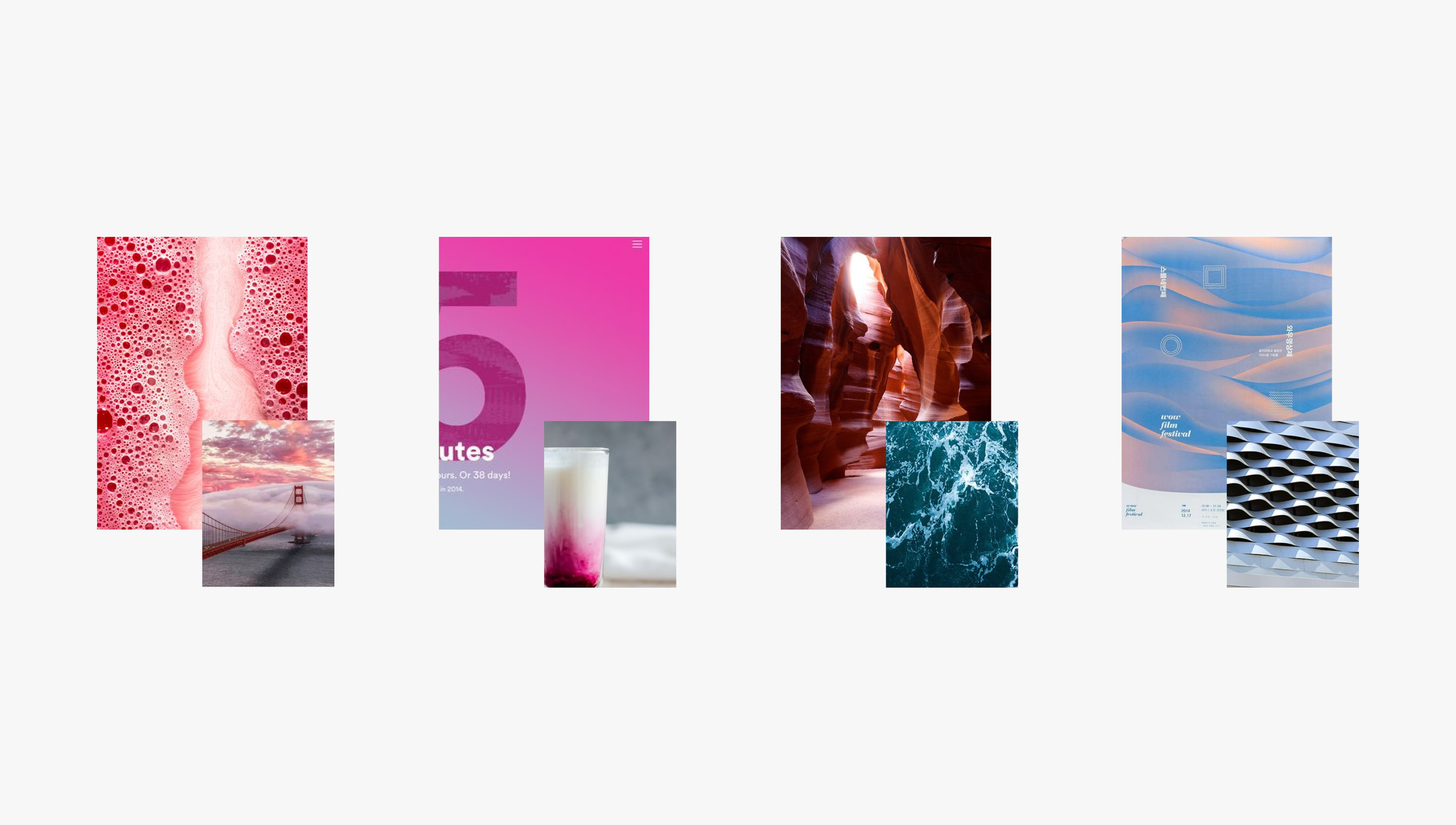
Concepts: I focused on the beverage’s unique cascading feature (macro moments, gentle gradients, earthly escapes and tangible texture)
Concept mockups: computerized these two directions, exploring ideas across menu sign, social, et
Motion concept mockups: frames revealed the beverage and design used shapes and gradients to mimic fog and the beverage cascade
Presentation: one of four directions presented to the President and Leadership team and was selected unanimously because it skillfully showcased the beverage itself, product name and key characteristics.
Photoshoot pre and post production: created a shot list that documented the props, ingredients and use cases. I also worked with the photo team in post production for selects, retouching and extensions.
Final creative: hero tea and coffee beverages used across campaign collateral
Retail: in-store menu, other retail collateral included an a-frame, entryway sign and countertop signage
Final video: projected on city buildings and played on all social platforms, showcasing the suite of tea and coffee flavors
Final video frames
Final billboard
Final subway wrap: car wraps were done as well
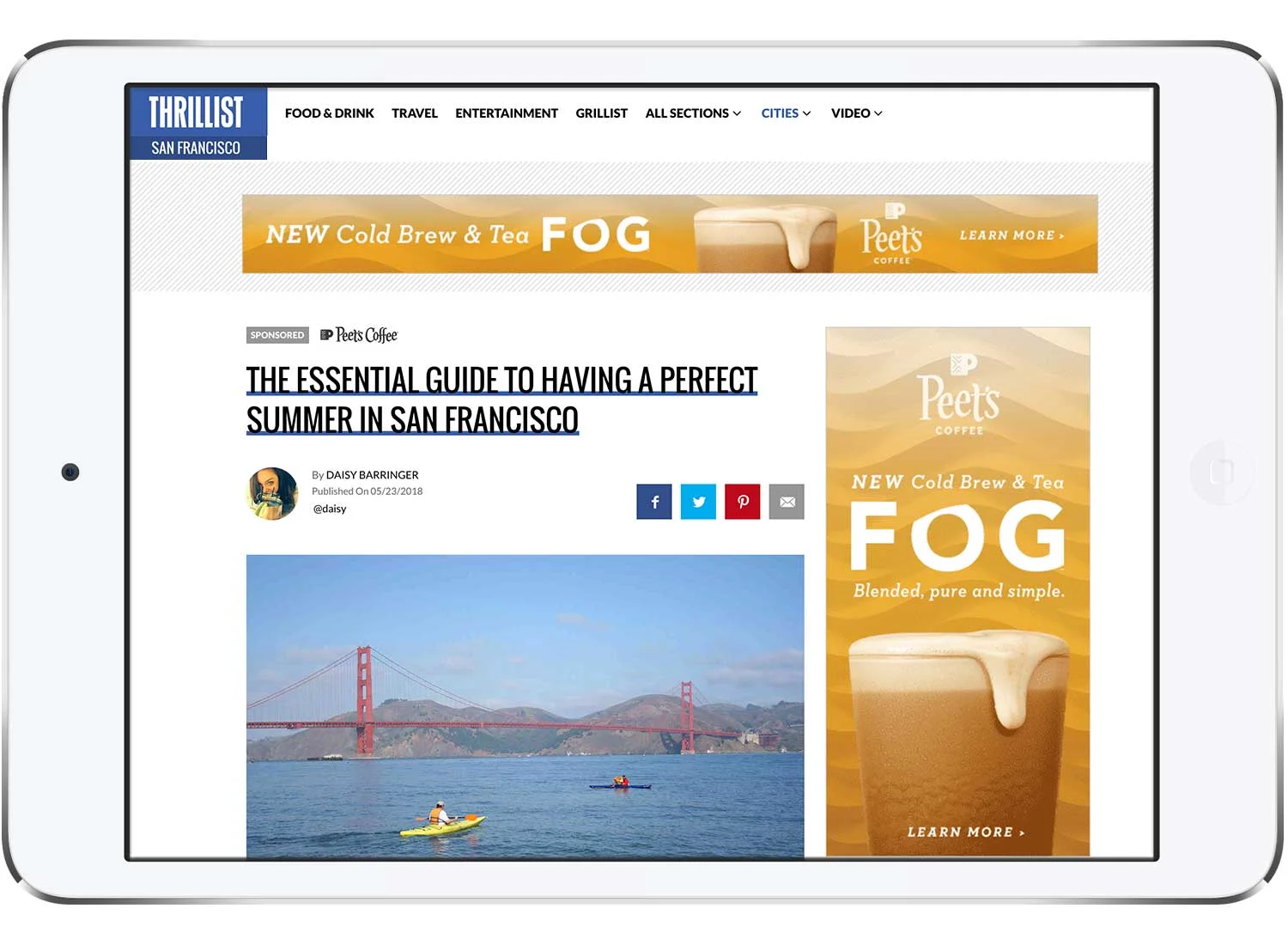
Partnerships: collaborated with online travel brand Thrillist for article tie -ins and targeted advertising
Events: branded tshirts were worn at events to promote the beverage, staff chose a color based on their favorite flavor
Final social photography: art directed a second photoshoot that captured the beverages in a more more authentic and natural style for social. Shots used for static and animated gifs.
Overview
Jira July is an annual social and community campaign that celebrates Jira customers all month long through social posts, community articles, contests, giveaways, and Jira Admin Appreciation Day.
The program launched last year with encouraging customer engagement, so the social team was ready to invest this year and requested a branded program that would bring even more excitement and engagement on social and Atlassian Community. They wanted a look and feel that was celebratory and summery and a system that would scale for years to come.
The process
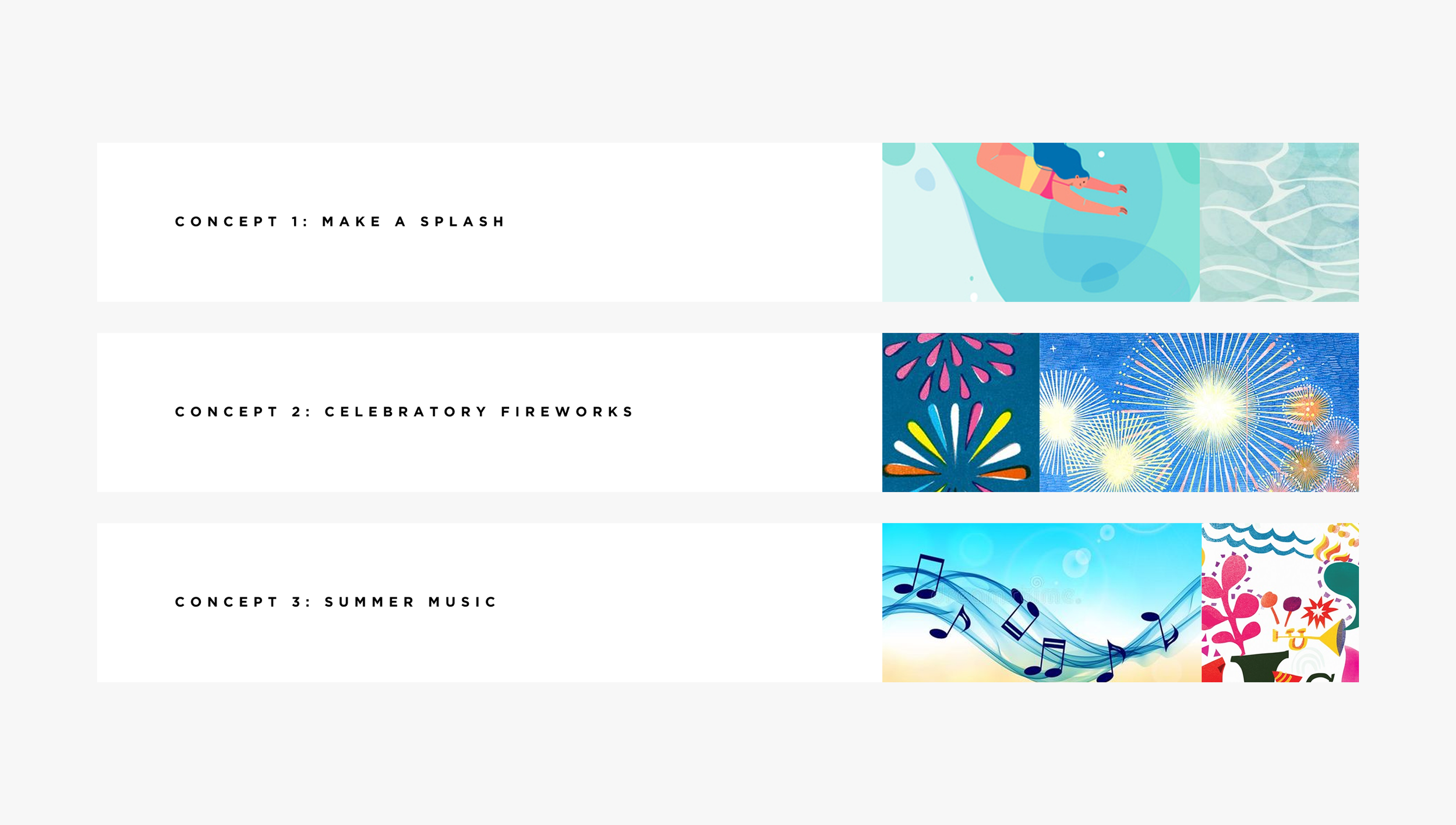
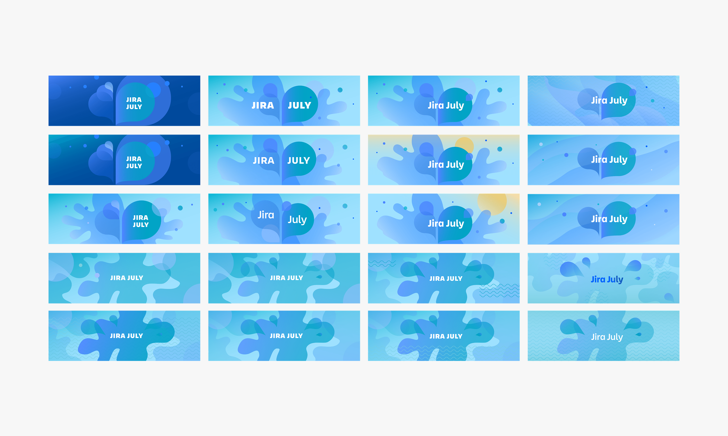
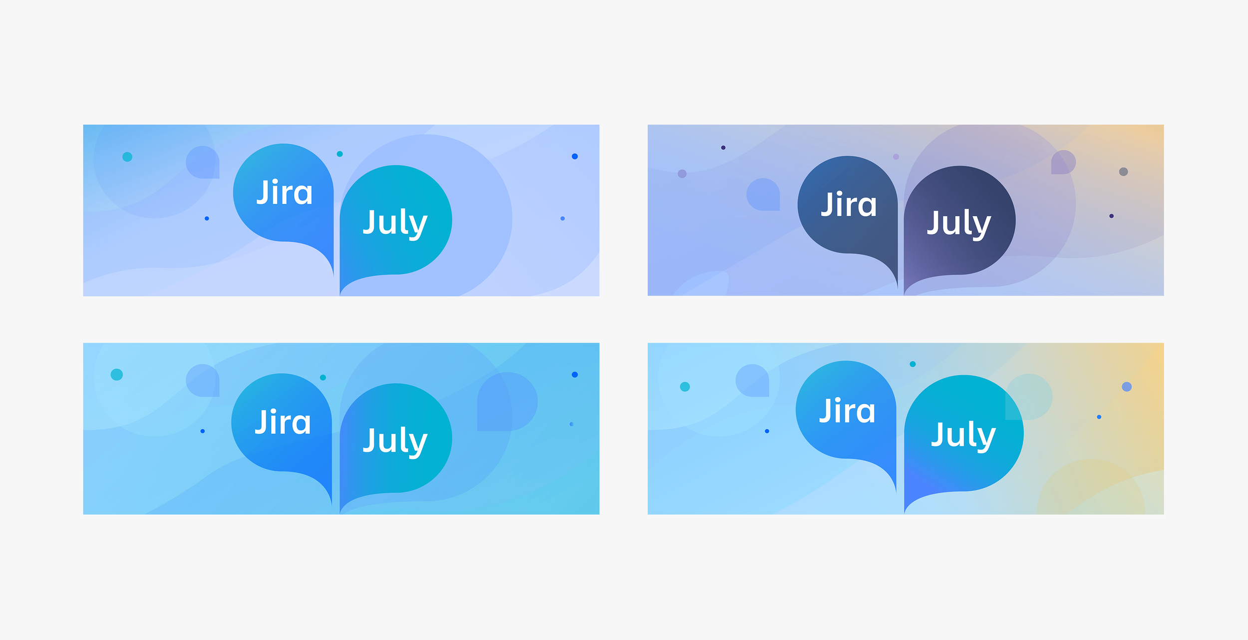
I was the sole designer on this project and worked closely with the social media manager. I explored numerous summer themes and presented three directions: make a splash, celebratory fireworks, and summer music. The stakeholder responded well to all the directions, but it was the graphic visuals and vibrant colors of the water theme that sold the direction.
In the design phase, I was inspired by the movement, shapes, and colors of droplets, splashes, waves, and water. I explored and pushed graphics, color, layout, and typography treatment, but stayed loyal to using the brand font Charlie to keep it tied to the brand.
After a few iterations, the graphic speech bubbles, also serving as splashes of water, brought the excitement of this summer program to life. And it was the dreamy sea blues and sunny warm hues that completed the look and feel of the program.
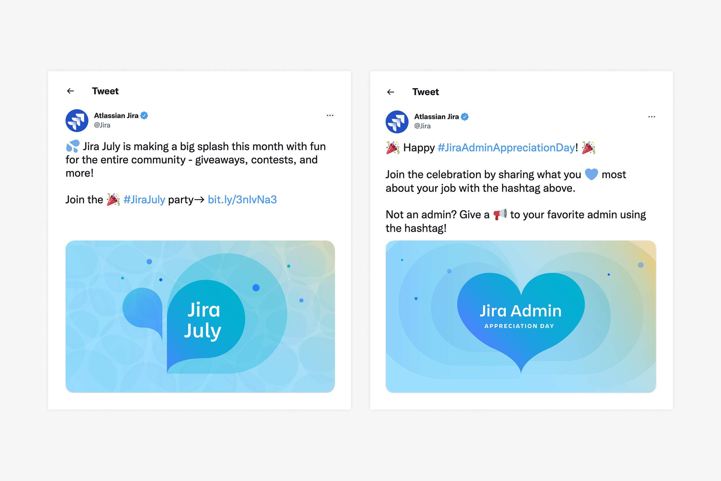
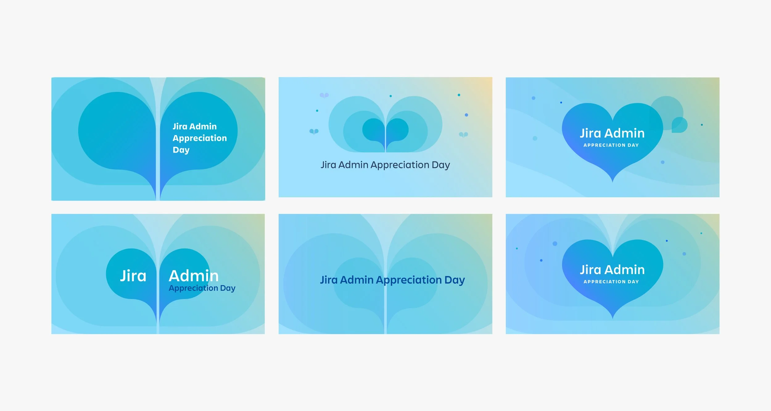
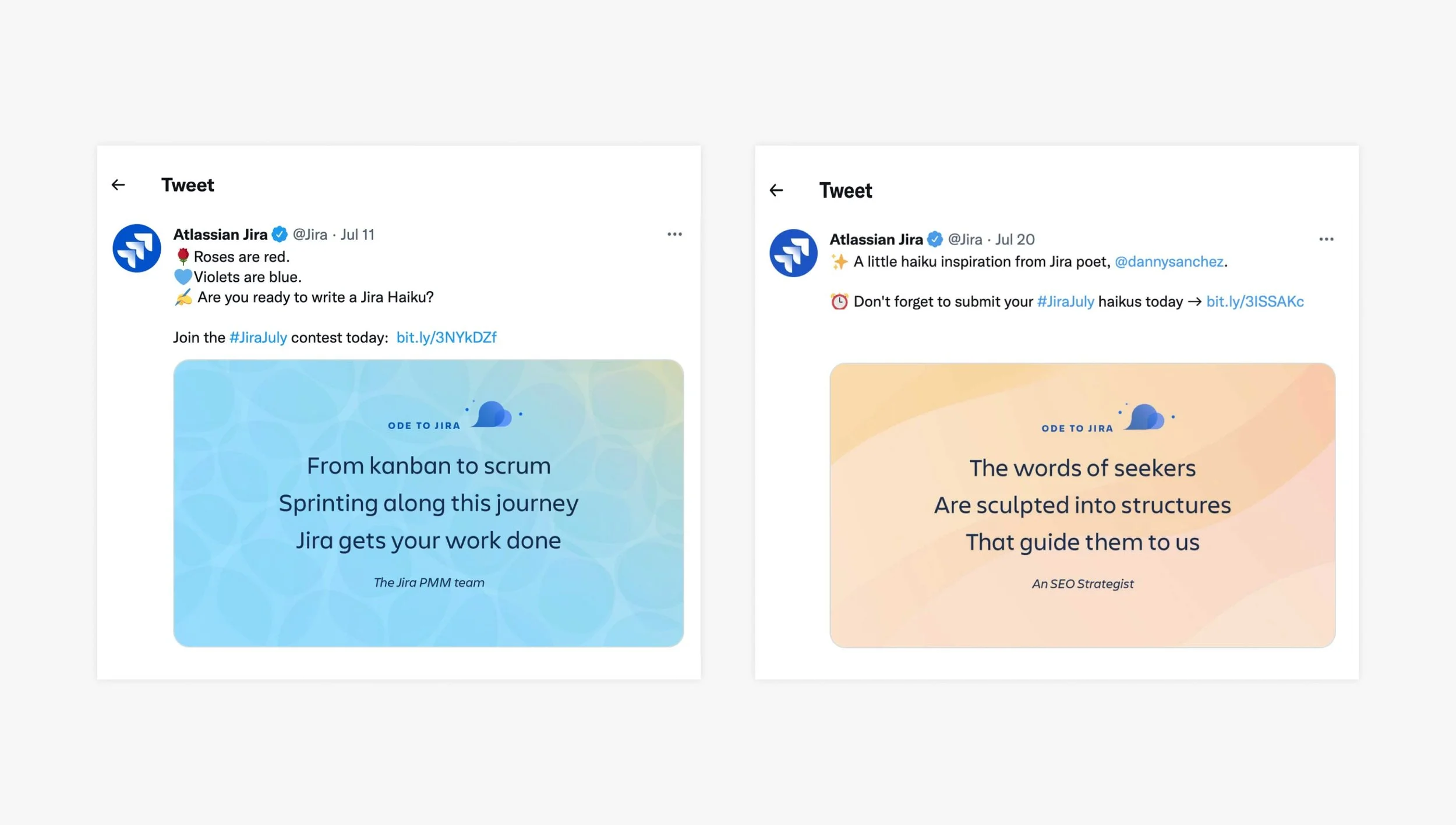
I leveraged the graphic bubbles to create three unique marks. Each mark matched with a category of content: Jira July, haiku contest (Ode to Jira), and Jira Admin Appreciation Day.
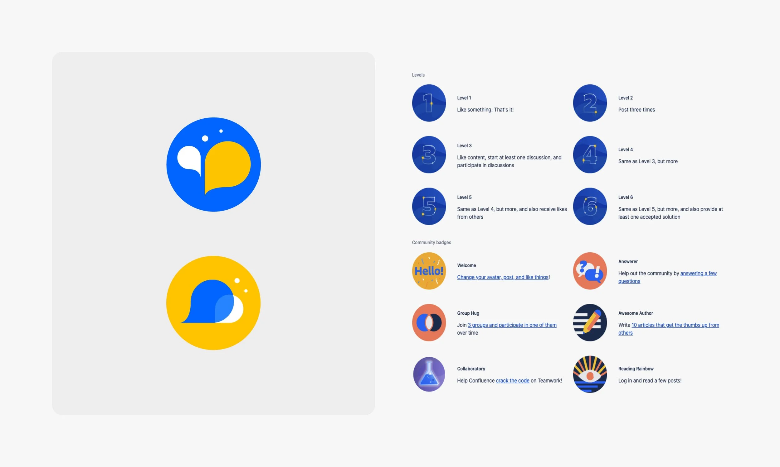
We also created Community badges for the Jira July program and the haiku contest that people could earn if they participated. The badge designs leveraged the visuals from the program look and feel, but leveraged the more minimal color palette and design of the badge design.
The impact
The program came to life over three weeks and was active for the entire month of July. Twitter and Facebook engagement increased by 856% YoY and impressions increased by 392% YoY. The program launch and haiku contest articles received the most page views on AtlassianCommunity. And the most popular Jira July events were Jira Admin Appreciation Day and the haiku contest, Ode to Jira.
The team
Social media manager
Concepts: presented three concepts to the stakeholder
Concept 1 exploration: Make a Splash was the chosen direction
Final visual direction: iterated on color palette
Final campaign creative: hero campaign visual that used summery yellows and blues and graphic shapes reminiscent of splashes and speech bubbles
Social: the campaign was announced and promoted across all social platforms (Twitter, LinkedIn, internally on Atlassian Community)
Program branding: the campaign was comprised of two programs. Ode to Jira and Jira Admin Day used the same components and color palettes, but each had unique visual branding.
Jira July branding: alternative campaign visual with lockup against a water background
Social posts: made a splash with the start of Jira July and shouted out all admins on Jira Admin Day
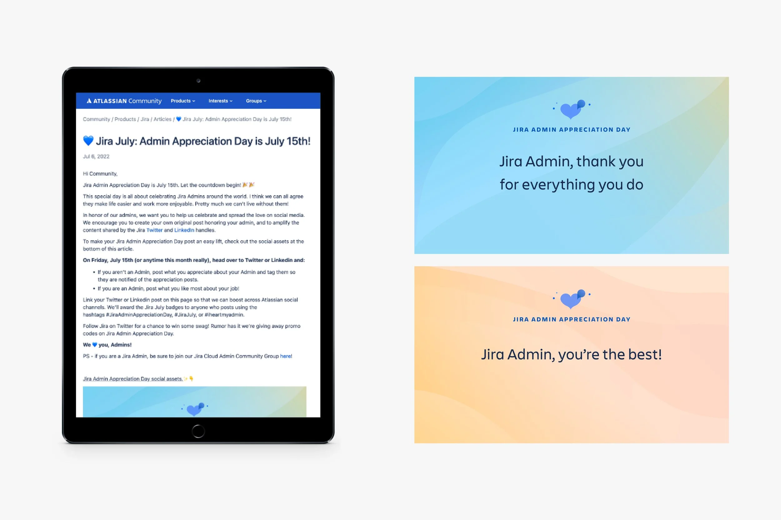
Jira Admin Day branding: tailored components to show love and appreciate
Jira Admin Day social posts: Atlassian Community post encouraged everyone to celebrate Admins on social with a heartfelt message and one of the provided social assets
Jira Admin Day branding exploration
Ode to Jira branding
Ode to Jira haiku social posts
Atlassian Community badges: earned a Jira July or Ode to Jira badge if they participated in the programs with a social post
Overview
The challenge was to update Scoop’s outdated brand guildelines so the Creative Studio and company had a complete and reliable resource for the brand’s voice + tone and look + feel.
The process
I worked closely with the content director to add sections like company values, tone, and voices. We also streamlined the color palette and added our expanded visual library, now three illustration styles, photography, and infographics. The guide articulated the proper usage of all elements and included examples of each in existing collateral.
As we created new content we were mindful of the guidelines, but made sure to assess learnings from completed work. We constantly evolved and tweaked assets to push the brand and kept it moving forward.
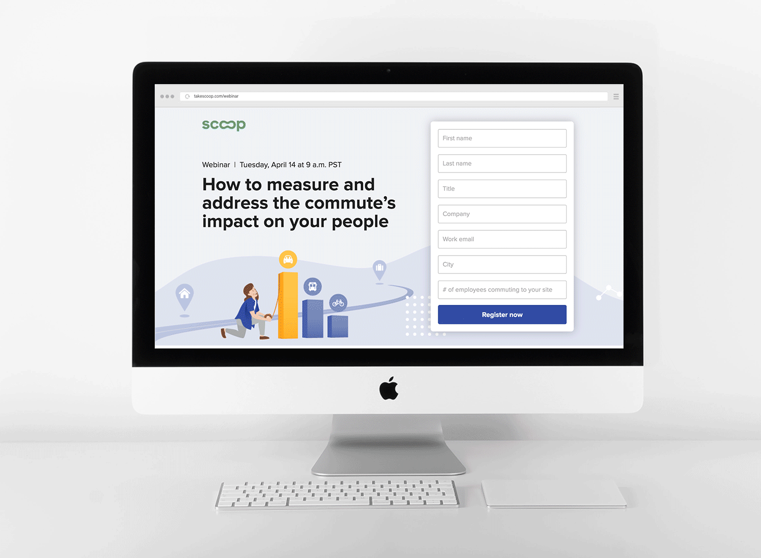
The Studio applied the new guidelines to create the team’s first whitepaper, digital ad campaigns, direct mail, and webinars that targeted HR, facilities, and sustainability leaders. The insightful content established Scoop as a thought leader in the transportation space and a legitimate partner.
I art directed the whitepaper, guide, digital campaigns, direct mail, and brand guidelines and produced the webinar’s digital ads, email, and landing page.
The team
Brand, content, marketing, and designers
Overview
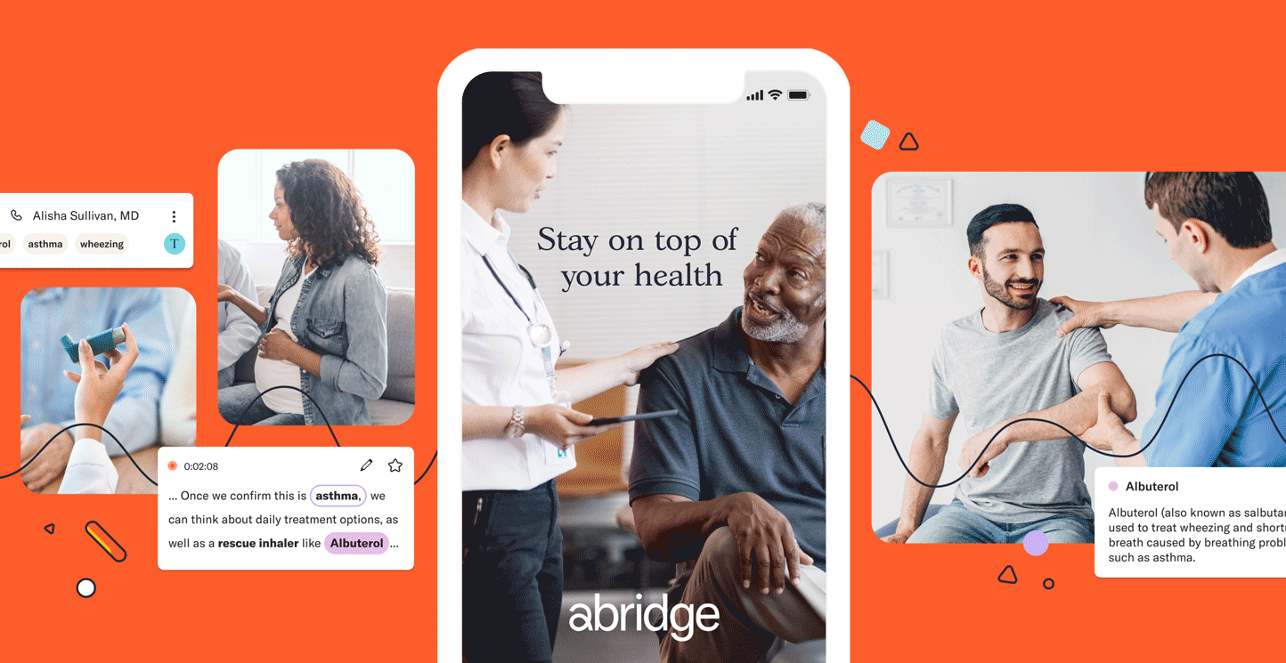
Abridge enables better care experiences for clinicians, patients, and hospital systems with its audio capture, transcription, and summarization capabilities. Their API and AI solutions capture patient and doctor conversations, summarizing their medical conversations and streamlining documentation for doctors.
The process
I joined Abridge a month before their launch to work on a GTM campaign and other first-time marketing materials, on and offline. I partnered with their Head of Marketing to advise on and execute new content and deliverables. All communication and feedback were done asynchronously with Figma and Slack.
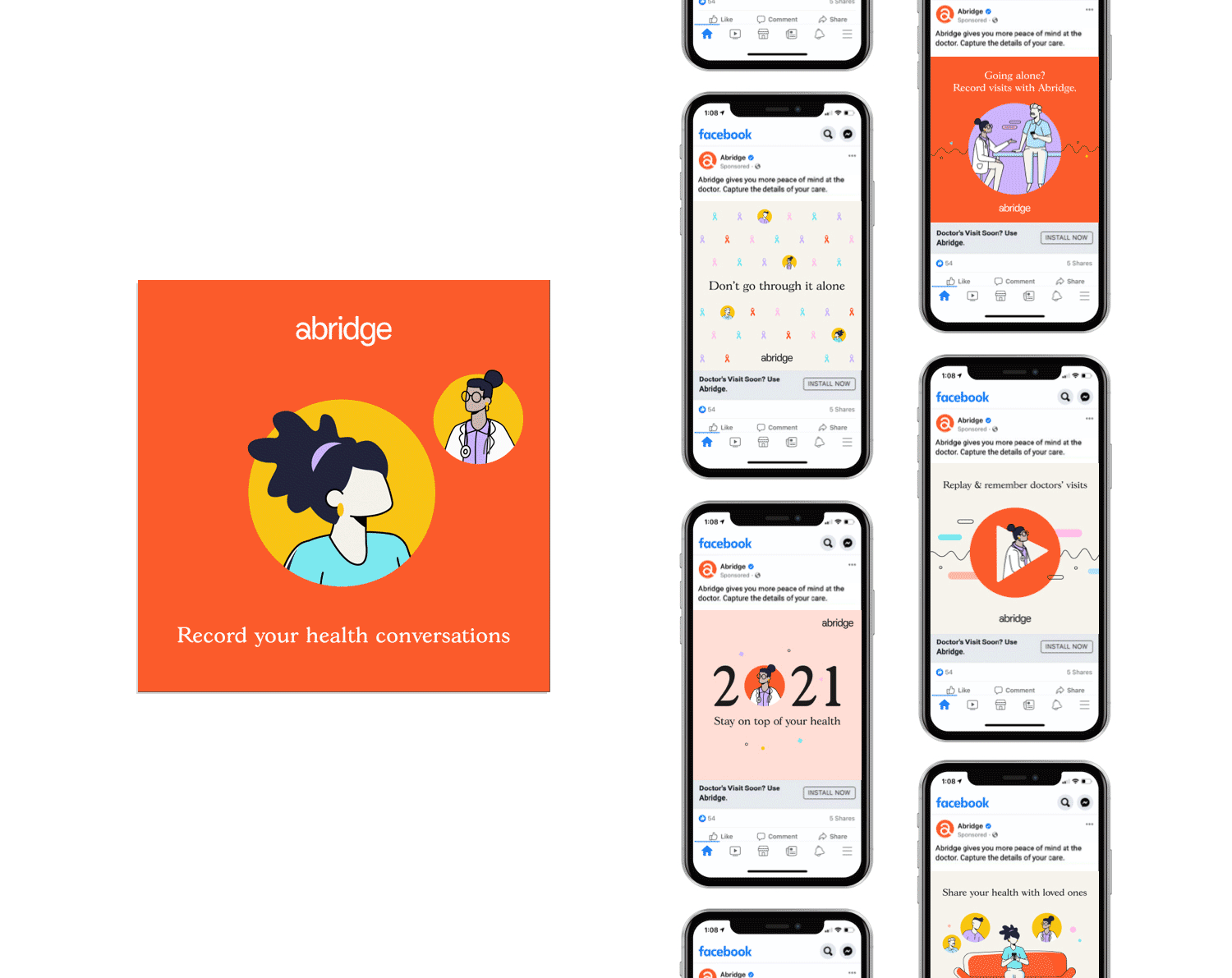
I leveraged their new brand guidelines to explore and push how colors, illustration and photography could be used. I produced brand assets for their social platforms and established their drip email campaign for a consistent and engaging experience.
Advertising was another area of exploration. I produced several digital campaigns that separately targeted patients and clinicians. We tested copy, visuals, and format across Facebook, LinkedIn, and Google/UAC. Abridge also had several print ads in “Elephant and Tea” magazine, which helped them reach a younger demographic faced with cancer.
One-sheets were also an area of growth and opportunity. I conceived unique design systems for both audiences, physicians and patients, and heavily guided content so they were approachable and skimmable. We also created several co-branded pieces as Abridge explored new hospital partnerships and ways to engage physicians and patients.
The team
Head of marketing
Overview
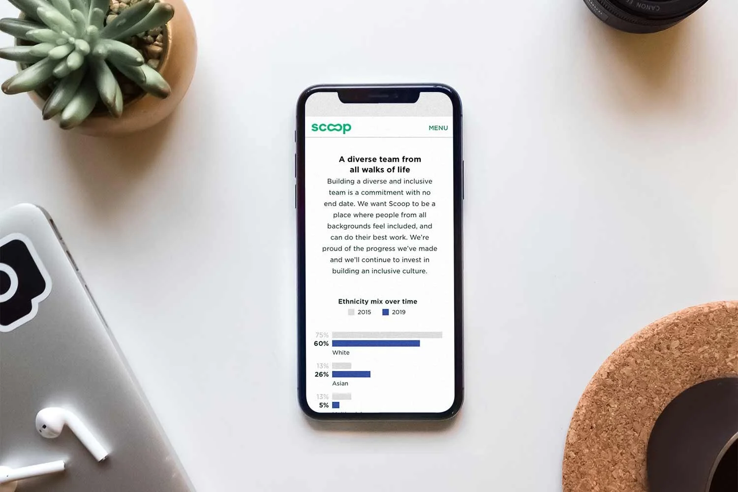
One of Scoop’s company goals was to significantly grow the team in the upcoming year, so they wanted to add a new Careers page to takescoop.com. The page would highlight the company culture, values, and job opportunities and be a resource for recruiters and potential candidates in the hiring process.
The process
Takescoop.com was outdated, but the team did not have the resources to redesign the entire site so we would only be designing the new Careers page. We wanted to be mindful of the user experience, but we also saw this as an opportunity to update the web experience and brand look and feel.
We kept core elements like the font and CTA buttons, and then updated the colors to be accessible and reflective of the brand’s current look and feel.
We partnered closely with the People team to solidify content and establish an authentic narrative for the page. After numerous design rounds and conversations, we realized we wanted to focus more on the people who made Scoop great. I ideated, managed, and art directed the in-house photoshoots and we added a new module to showcase people’s unique journeys at Scoop.
Design reviews were a combination of scheduled and asynchronous meetings. I posted all design rounds in Zeplin the day before reviews, so the team had proper time to assess and leave comments. Upon building, I had regular interactions with engineering to ensure new features like the quotes, stats, and job listings were being implemented properly and appeared correctly on all devices and platforms.
The impact
In the end, the page shipped on time, and the company achieved its hiring goal, doubling in size by the end of the year. The new page proved to add value to the interview process for both the candidates and recruiters.
Candidates referenced the page to recruiters and were appreciative of the transparency about our diversity, benefits, and value.
Recruiters also commented that candidates asked fewer culture-related questions once the page was live, which allowed them to speak about other valuable topics.
The team
People director, brand manager, photographer, copywriter, project manager, engineers, and product
Overview
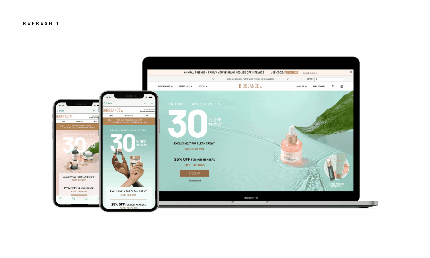
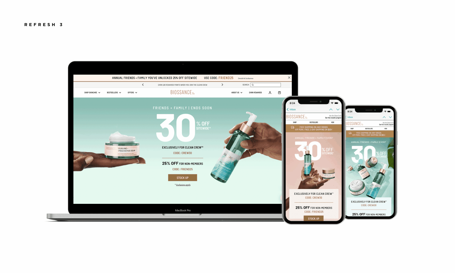
Biossance is a clean beauty brand that uses biotechnology to create sustainable and safe skincare products. The team requested a new design system for their 12-day Friends and Family annual summer event.
The process
For this project, I worked directly with the Creative VP and Design Director. The program required a memorable lockup and a fresh photography direction that could tell a variety of stories and pair well with existing photography. The event expected numerous site refreshes, daily emails, and regular social posts and stories, so the photography needed to be versatile and scalable.
In addition, the photo team had less time to shoot this campaign than in previous years. This meant we needed to be strategic and selective in what was shot and how, and make sure the new photography could sit seamlessly with existing images.
The impact
The photography concept was seamlessly replicated and beautifully integrated with existing photography to create a robust fresh campaign and an expanded photo library. The program lockup proved to scale well with the variety of events, copy, and design deliverables.
Final creative was applauded internally and the scalable inclusive solution was used 2 years in a row.
The team
Creative VP and Design Director
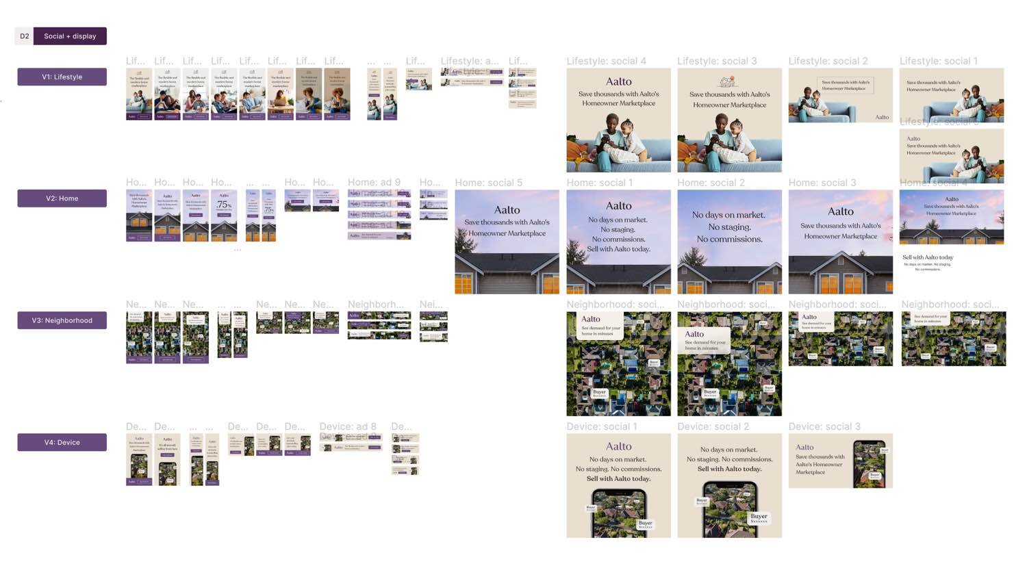
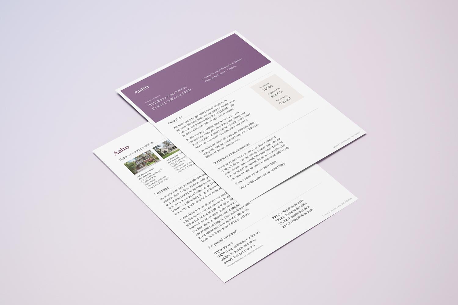
Overview
Aalto is the Homeowner Marketplace and is the flexible and modern way to buy and sell homes. The Marketplace connects sellers to qualified buyers, and saves homeowners time, stress, and money with its low 0.75% fee and complimentary virtual staging.
The process
I started partnering with Aalto a month before they launched. They had one designer who worked primarily on the product, so I was brought on to develop their brand and marketing assets.
The brand guidelines were a work in progress, so I helped to unlock the look and feel across color, layout, and photography. After numerous iterations, we introduced a warm secondary purple and ownable sunset photography style. We transferred the sunset photography to ombre backdrops, which we used in assets like the website's loading photos and the back of the business cards.
I concepted and executed a number of key assets that jumpstarted the brand: GTM social and web ads, one-sheets, bi-fold direct mail, internal presentation deck, and business cards.
All design rounds were shared in Figma for easy collaboration and I received streamlined feedback in tools like Loom. I transferred the final digital ad designs to Canva so the team could swap and test copy, and I created templates in Lucidpress for print pieces like the direct mail and one-sheets so they could be edited.
The impact
The expanded brand guidelines provided rich visuals that could be applied to the entire brand for a seamless customer experience and differentiated them from their competitors.
The new templated collateral system allowed the team to work autonomously, efficiently, and quickly. The team could test creative as they needed, updating creative copy and visuals, and they weren't at the mercy of a designer's time or budget. The professional look and feel of the collateral also legitimized them as a real contender in the space.
The direct mail increased traffic and signups, and ad engagement increased on those including houses versus humanity.
The team
Head of Marketing, Head of Design, and General Manager
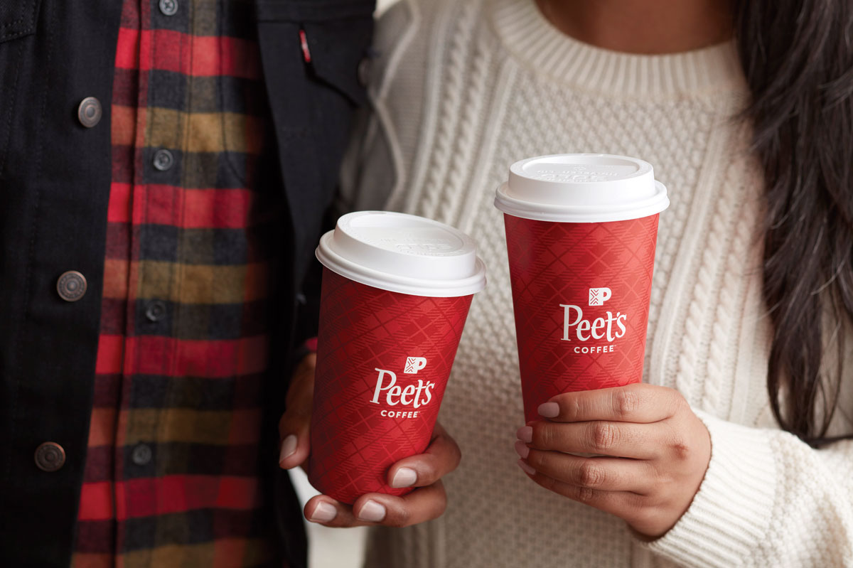
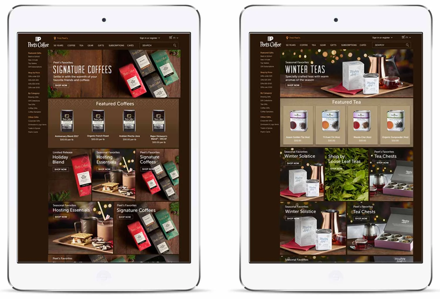
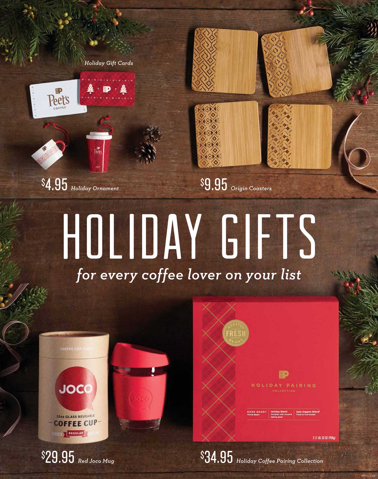
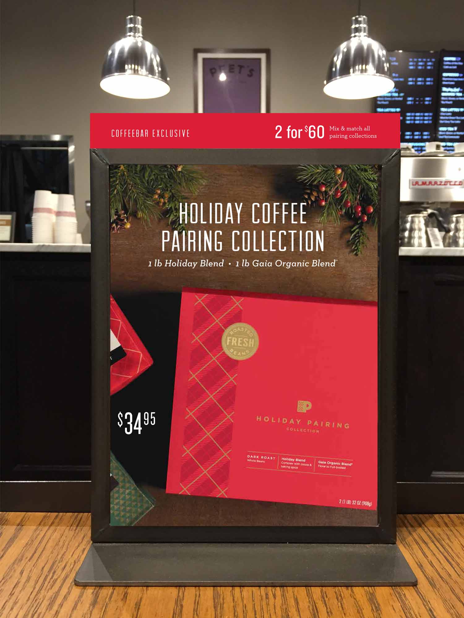
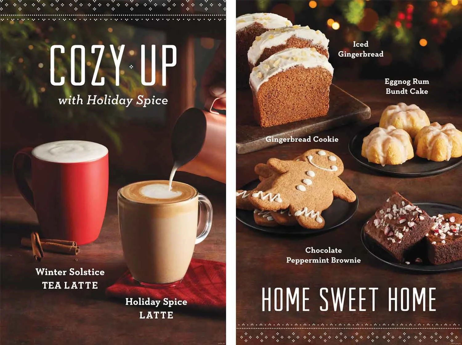
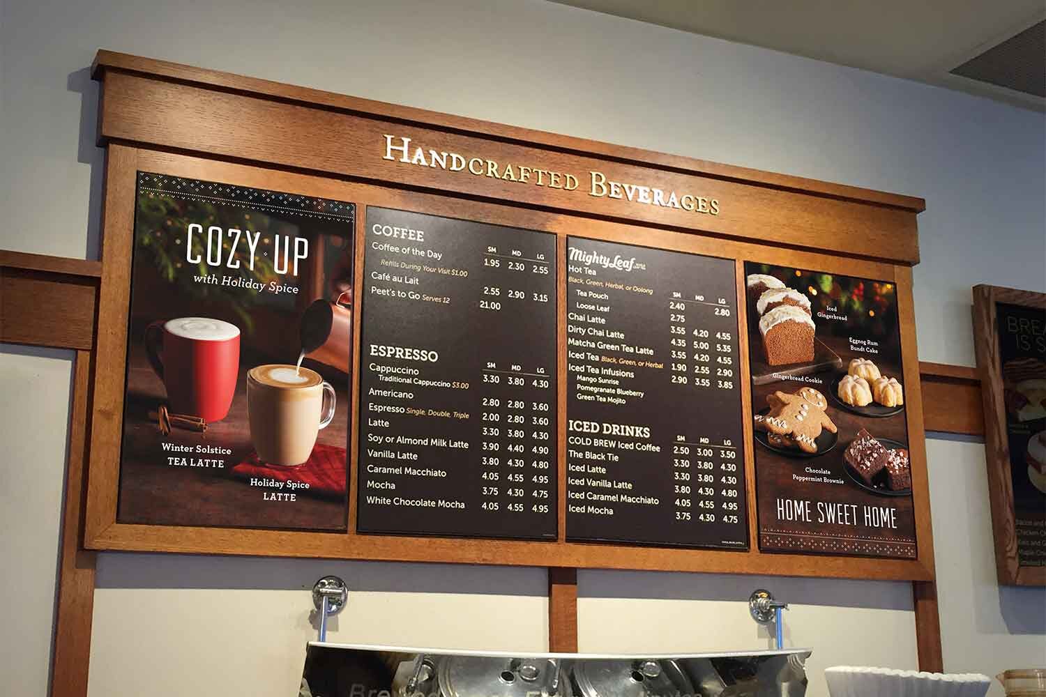
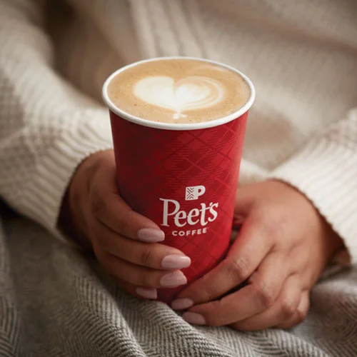
Overview
Holiday was Peet’s largest program of the year. This year the request was to push beyond our typical winter theme and create a festive Christmas campaign that could be celebrated across the entire brand (CPG, retail, wholesale, e-commerce, and social).
The process
In the past, Peet’s stayed clear of Christmas and religious references, so this opened things up creatively. While the doors seemed wide open, the concept phase proved to be the biggest challenge. We explored Christmas traditions with classic visuals like elves, gingerbread, music, and more, but none of these directions resonated or landed with the team. With an additional concepting round, we finally landed on that memorable holiday moment when you’re cozied up in front of a crackling fire with a warm cup of Peet’s.
This campaign required the deluxe lineup of creative assets and three photoshoots. Unique items to the program were holiday-designed hot cups, bean bags, foiled gift cards, a new embossed gift card carrier structure, merchandise, gift packages, and updated red pricing menu boards. Note, designing the holiday hot cups was especially exciting because it was the only time of year Peet’s debuted new cups and customers looked forward to the reveal every year.
Fun fact: we had a cloth napkin produced with our red holiday plaid to be styled with our products in our photography.
My role
I concepted, art directed, and executed the campaign: POP, packaging, and merchandise across retail, wholesale, CPG, e-commerce, and social. I also press-checked the POP, hot cups, and gift cards at three different printers.
In addition, I concepted and art directed three separate on-site photoshoots for retail, e-commerce, and social. This included pre and post-production.
The team
President, brand, marketers, photographers, food stylist, prop stylist, photo retoucher, copywriter, designers, project manager, printers